Royal Black
The Royal Black brand of black caviar has existed since 2006, and all these years it has existed with the same logo. And it was fine, because the quality of black caviar brand was excellent, people took it. Now there are other strong players on the market with more modern packaging and a more relevant brand. It has become more difficult to sell, and especially difficult to sell in the premium segment to new customers in the age group of 30-40 years old. That’s what the client came to us with. We offered a lot of options before we all amicably settled on this one.

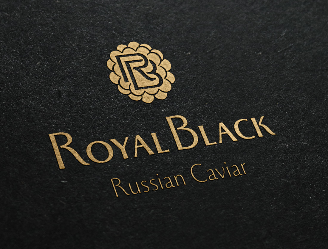
The logo looks much more modern and, most importantly, now there is the product itself — caviar.
The main advantage of the new logo was the readability of the brand name and ease of use of the logo on different media
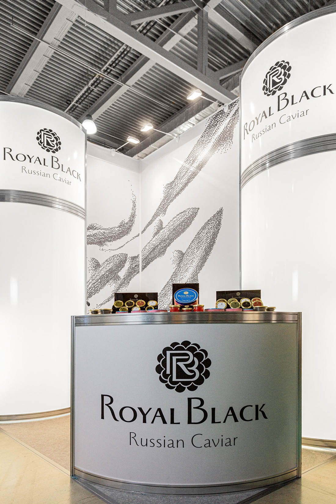
The visual components of the brand with the help of graphics are stylized as caviar, here we see sturgeon, but it can be any image, executed in such graphics.
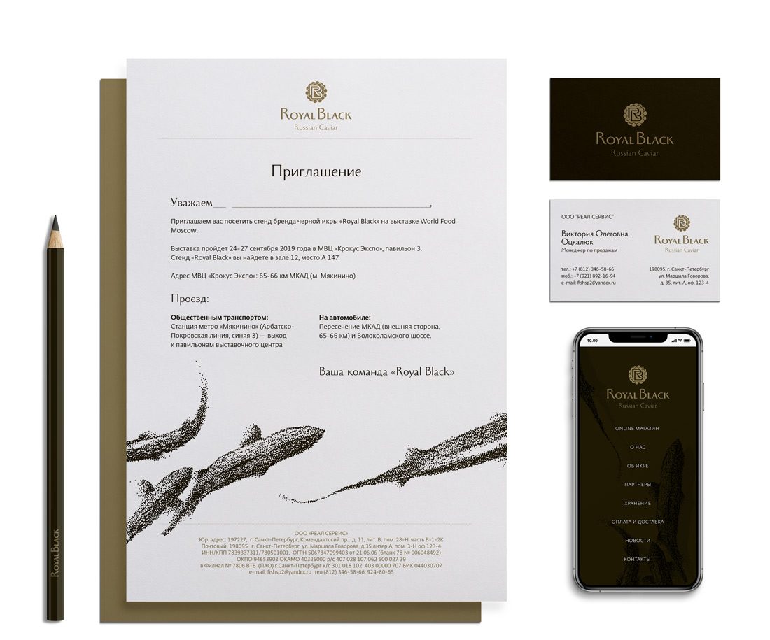
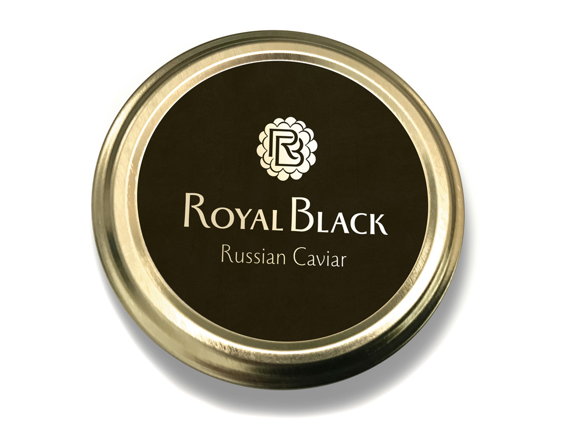
The packaging design is minimalist — it’s our cool logo printed on the lid. We also did an exhibition booth design for the client that turned the most simple and inexpensive exhibition construction into a premium small brand area.
The brand participated in the World Food Moscow exhibition. We had to make a beautiful stand simply and quickly from available constructions.