Petersburg Theatre Seasons
The old version of the logo showed applause and a ship from the Admiralty, the first images that come to mind when mentioning the theater and St. Petersburg, which have been used many times. We developed 4 new variants of the logo and each of them corresponded to the set tasks. As a result, the most emotional one was chosen.
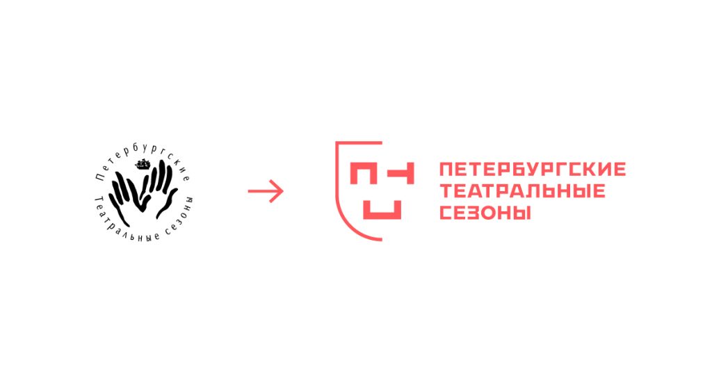
Logo
The logo is based on comedy and tragedy, the fundamental genres of theater. We depicted them in the form of two theatrical masks, with the first letters of the Festival’s name playing the role of emotions. The main version is the mask with the joyful emotion.
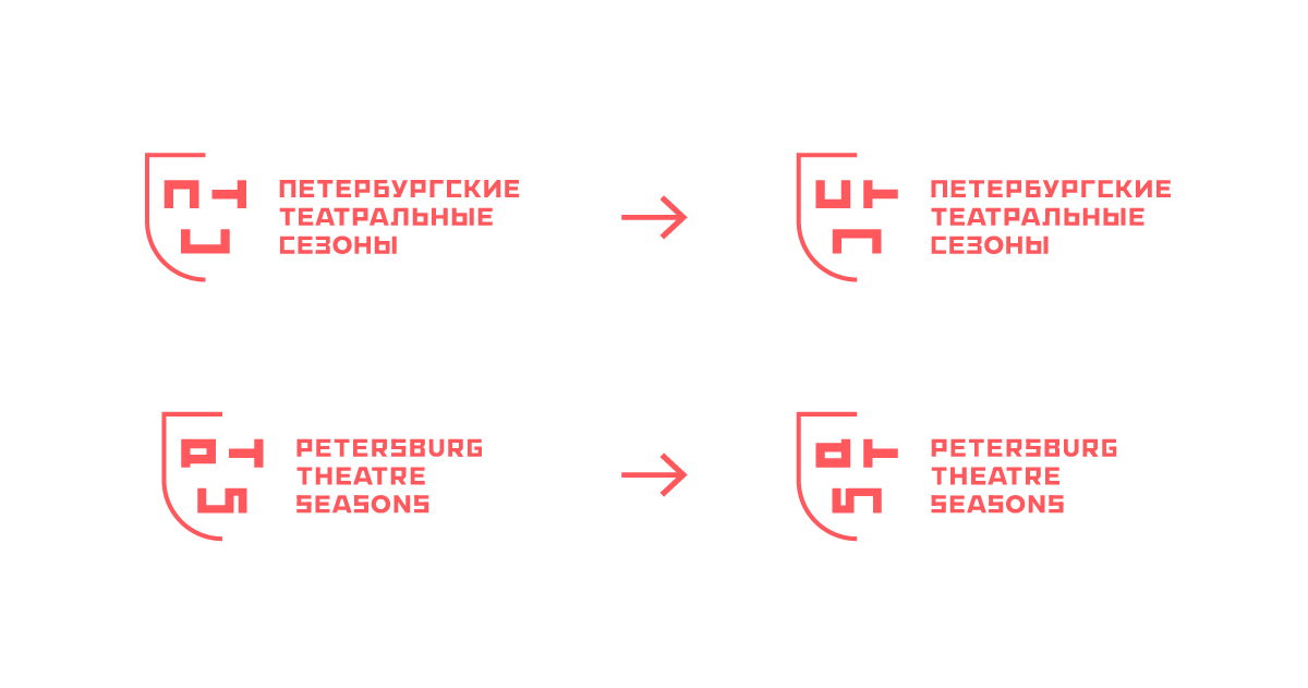
We developed several versions and color solutions for the logo. It was also important to work out the English version of the logo, because the festival has long been international.
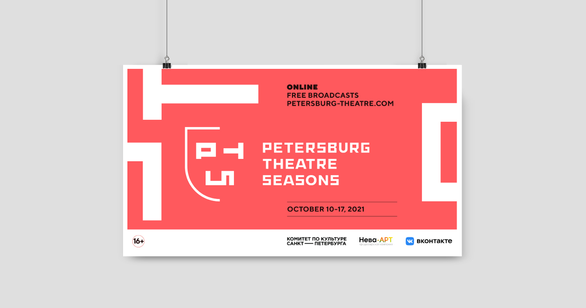
Font and colors
We chose TT Norms. It’s chopped, readable, has an unusual layout (combining sharp corners and rounded shapes), and looks great in any typeface on any medium. Developed only a few years ago, it perfectly conveys the idea of updating the theater, its entry into a new format for the theater online, and it is important that this font is perfectly readable on screens even with a small resolution.
The combination of black, white and red has long been classic and very common. So, we decided to freshen up the color palette by replacing the usual red with coral. It still conveys the idea of red in theater interiors: the velvet used for curtains, seats, carpets, or even walls, but due to the lighter shade it makes the whole image easier to perceive and doesn’t seem so heavy and boring.

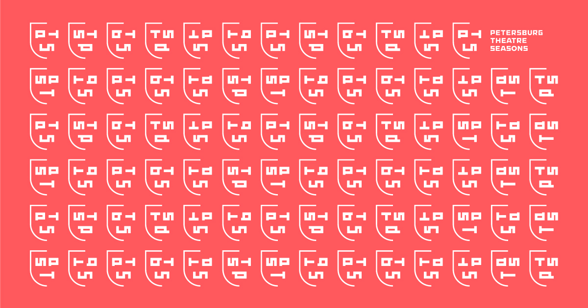
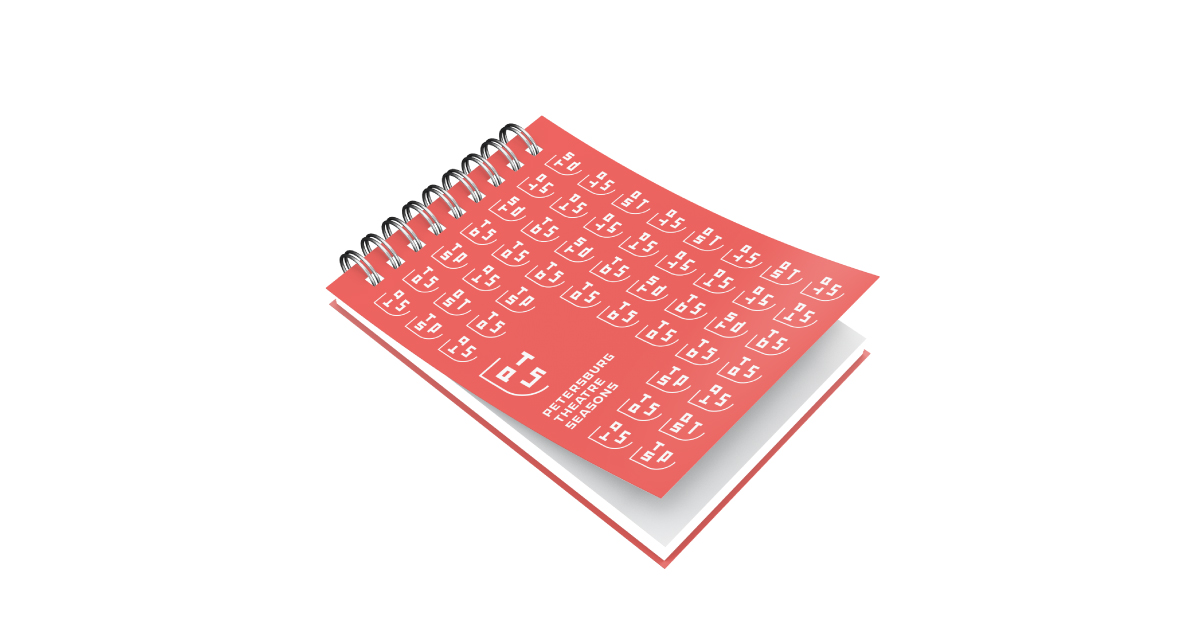
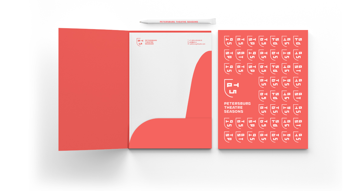
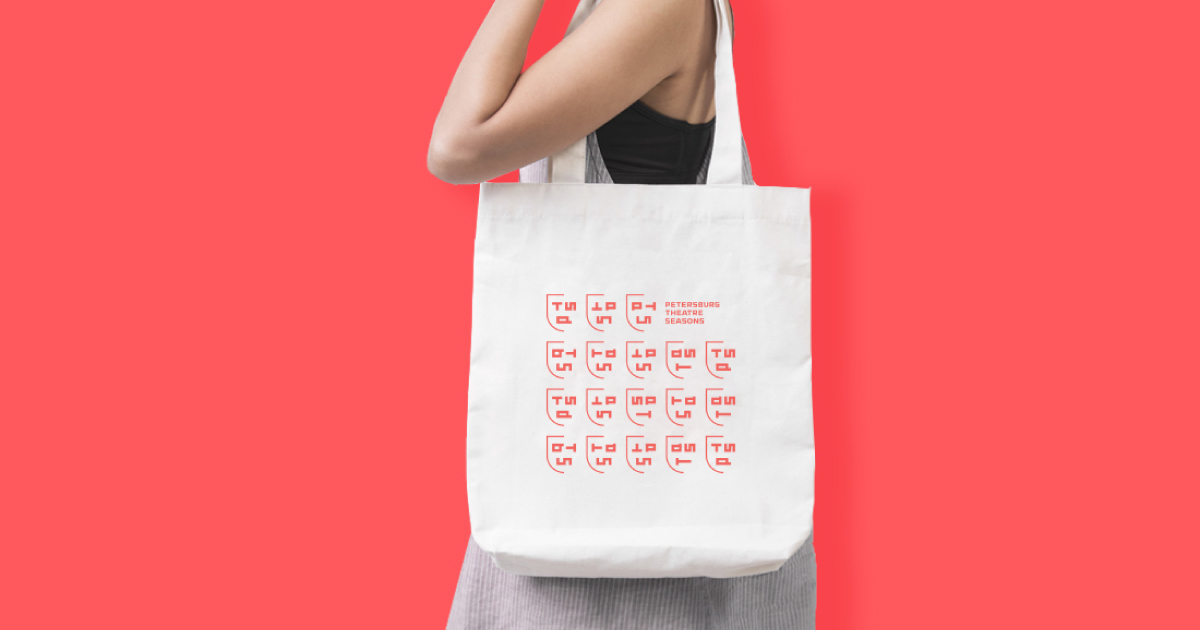
Pattern and merch
We developed a corporate pattern with a greater variety of emotions, still assembled from the letters. It is noteworthy that for the English version of the logo we made our own, English-language pattern.
To create a complete brand image, we prepared merchandise, posters, and social media design. This will help users, both those who are already familiar with the festival and those learning about it for the first time, to identify it among others.
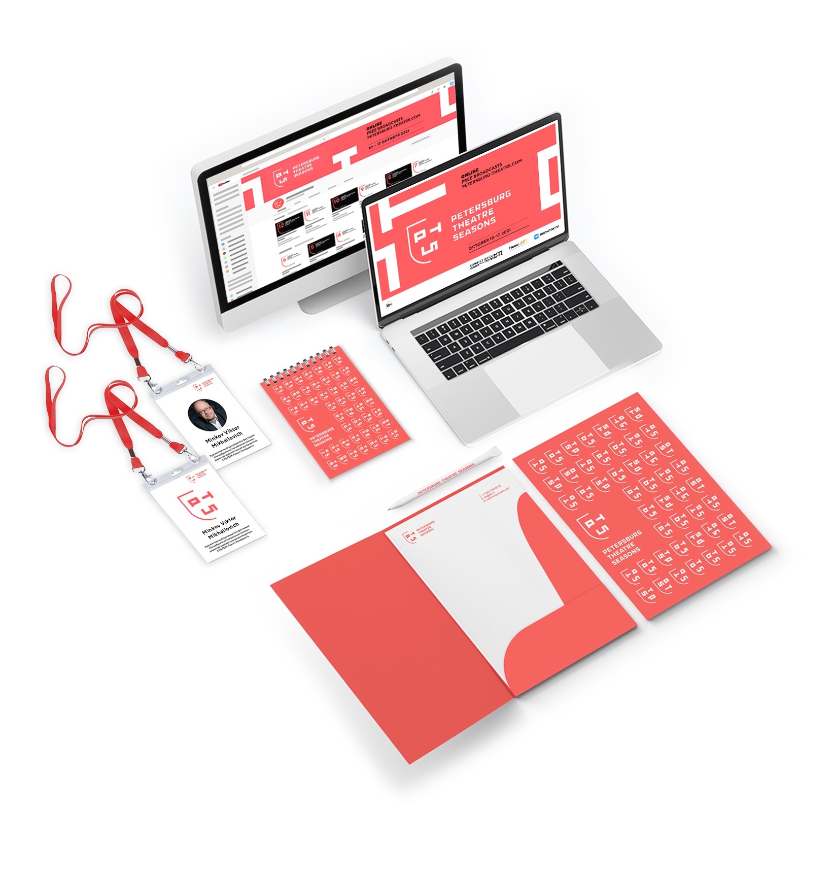
To facilitate further work of the guys with the graphic representation of their project, we put together a guide on the use of corporate identity, and prepared an archive with ready-made files to print.
These tools will simplify further work and help you quickly navigate and meet new brand design or print production needs.