RosDorBank
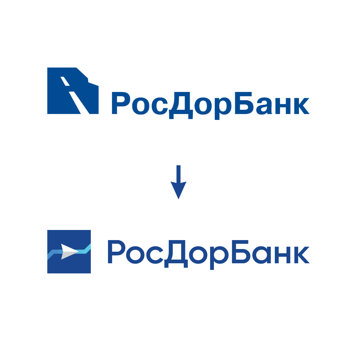
Our task was to develop a new logo emphasizing continuous development and forward movement, and to create a modern look, without losing recognizability.
 |
 |
 |
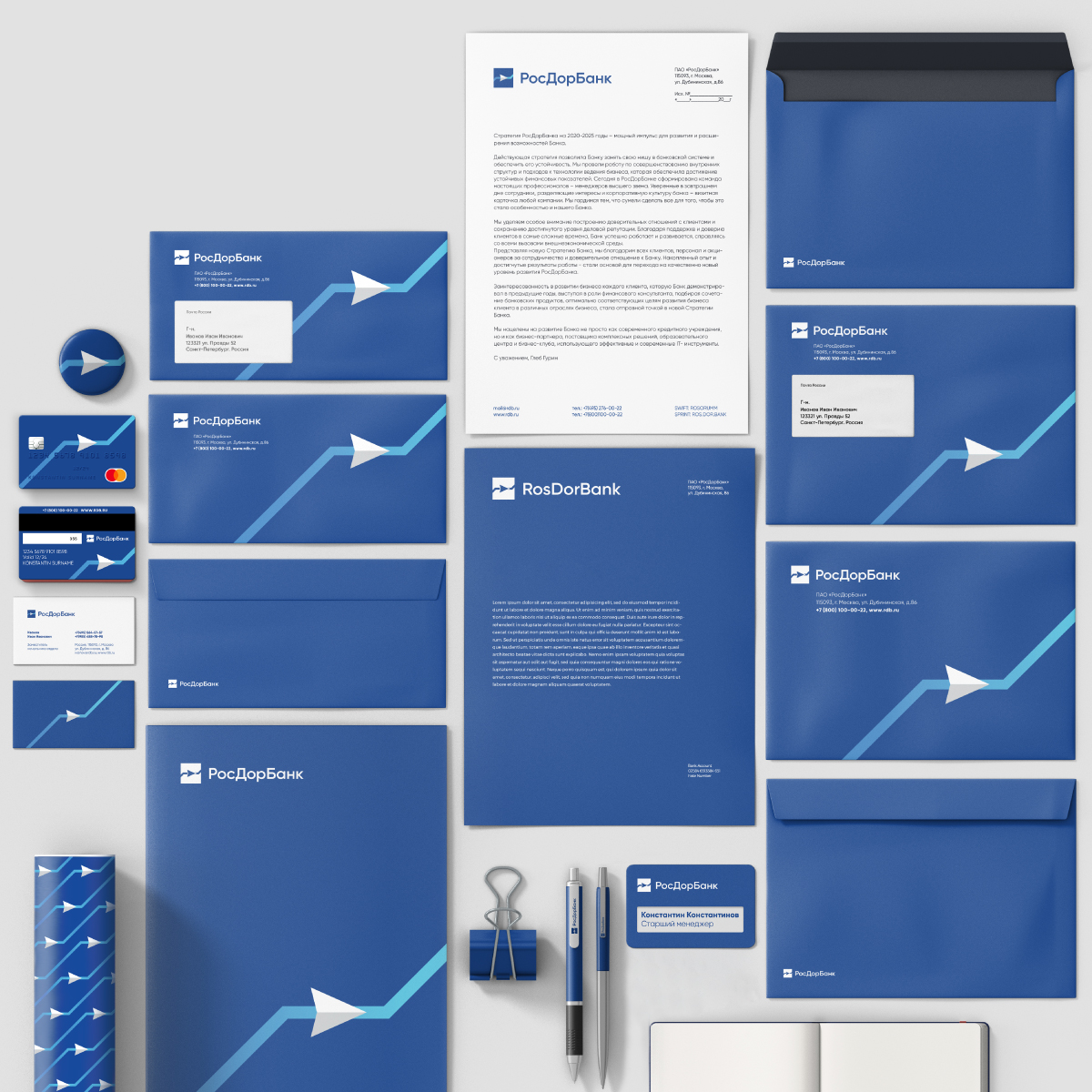
In each element we tried to reflect confidence and reliability, as well as to show the association with the graph, demonstrating the continuous growth of all financial indicators. The blue color underlines the continuity of the new logo. Also the arrow symbolizes the vector of the intended direction and continuous movement forward to success.
 |
 |
 |
 |
 |
 |
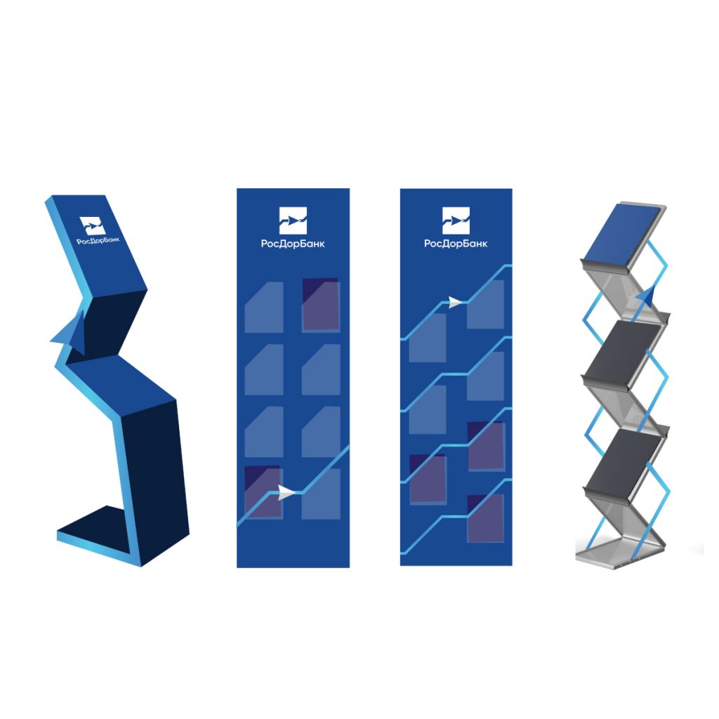
The pattern based on the new logo is bright and dynamic.
 |
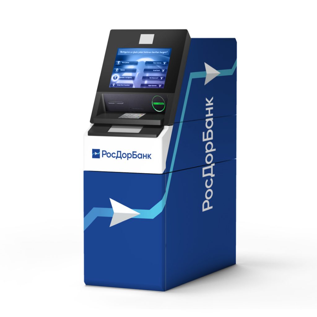 |
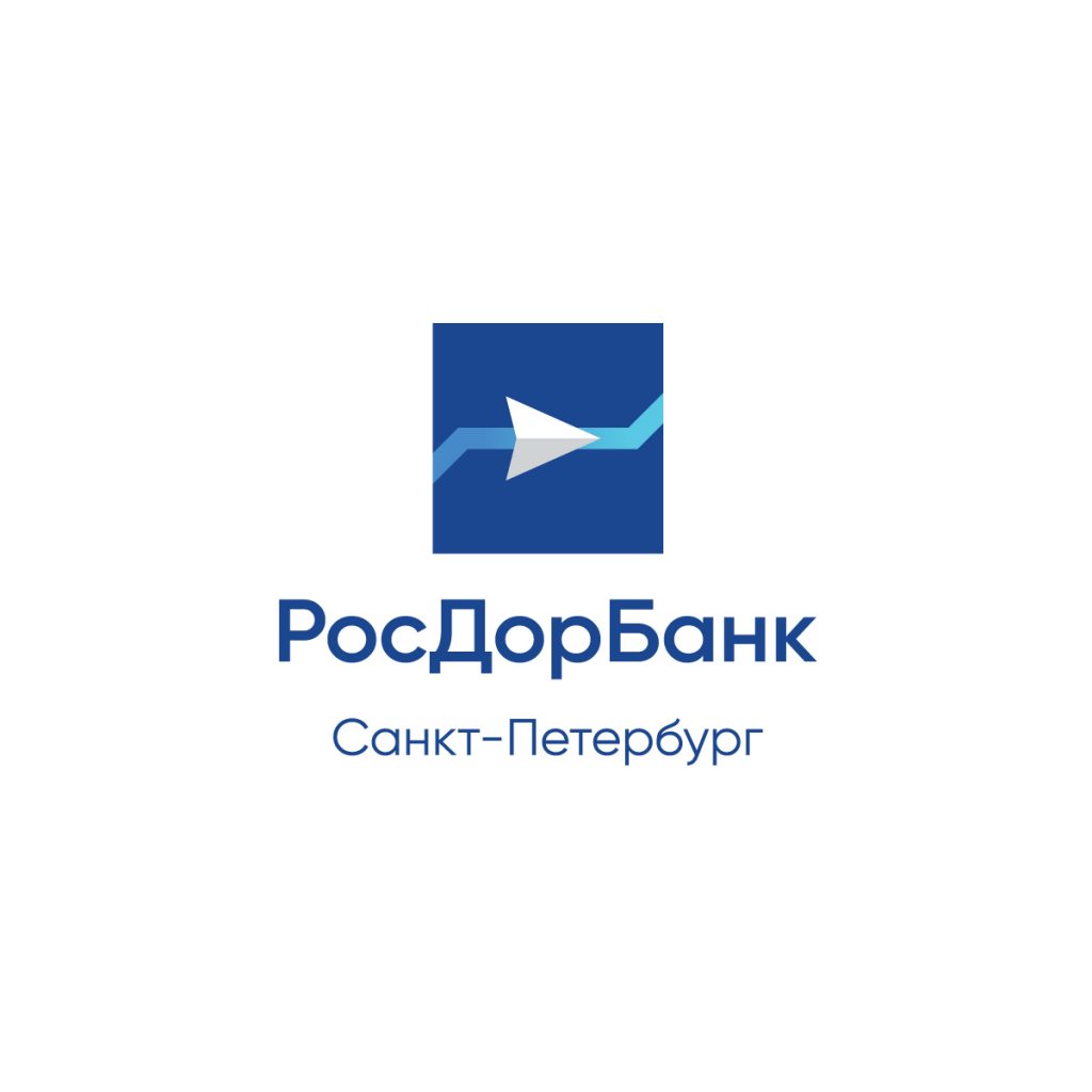
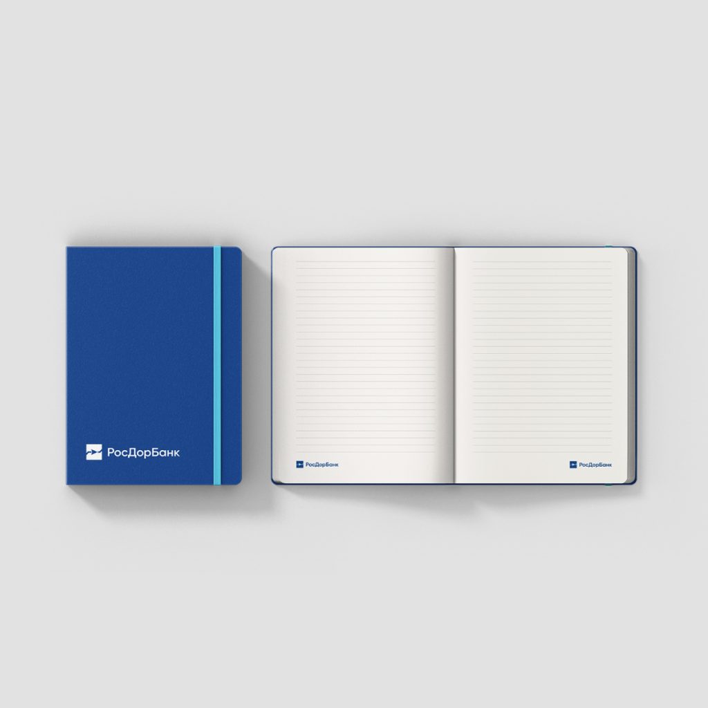
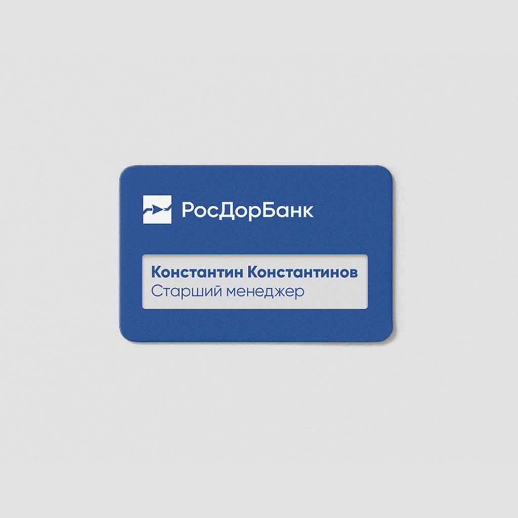
The new corporate identity refreshed the bank’s image while maintaining recognition.
 |
 |
 |
 |
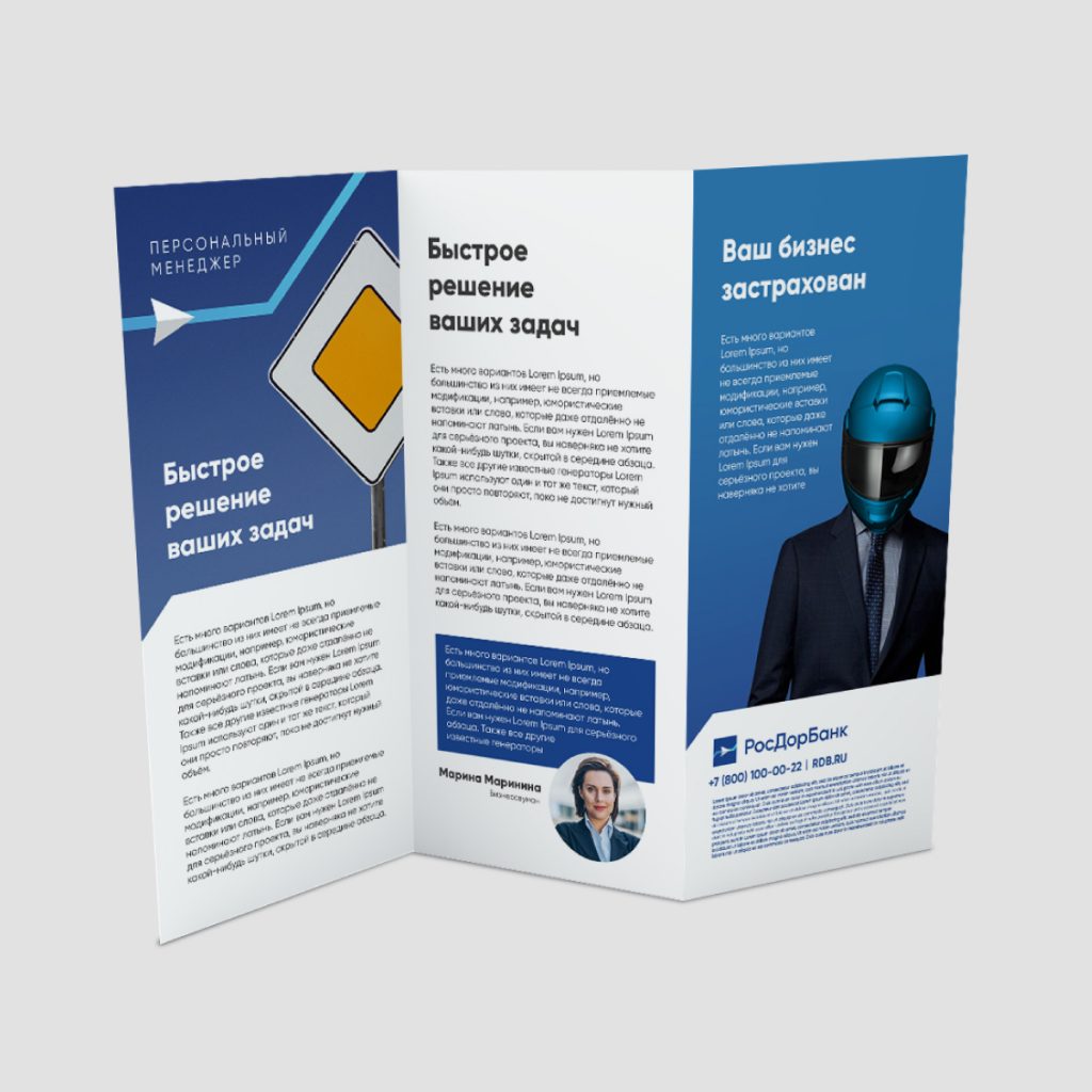 |
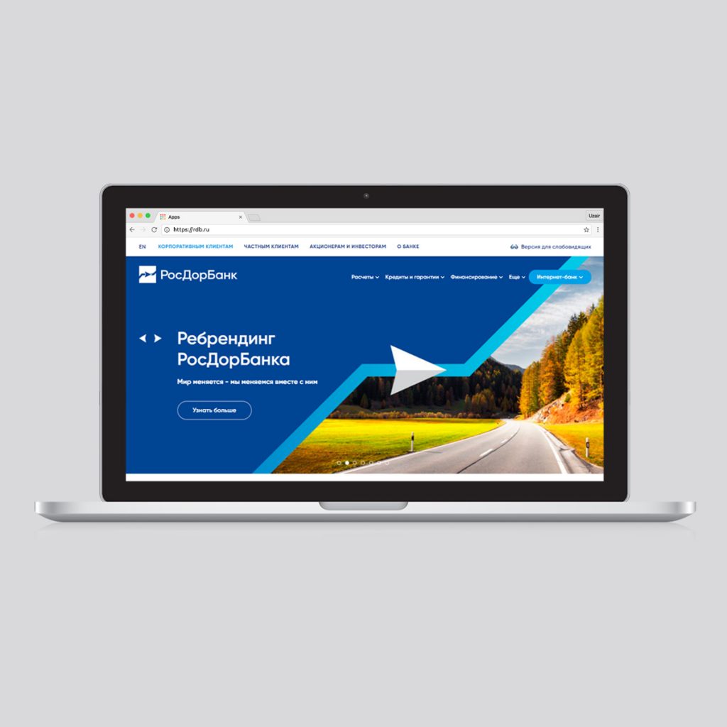
We have developed not only the design of elements of printed materials, navigation within the bank, corporate maps, but also the design concept of the bank website
 |
 |
 |
