Colossi Games
The rebranding had several tasks:
- Make the image of the company more dynamic, modern and bright
- Help with attracting new partners by showing them a solid concept, a clear strategy, as well as reliability and commitment to new heights
- Help with attracting new employees, with «visualization» of corporate culture with the help of pictures and colors, so that from the first contact with the brand the guys have a feeling of belonging to a modern, bright, interesting and developing project.
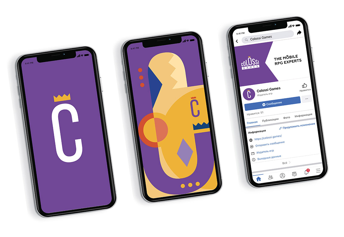
Philosophy of the new logo
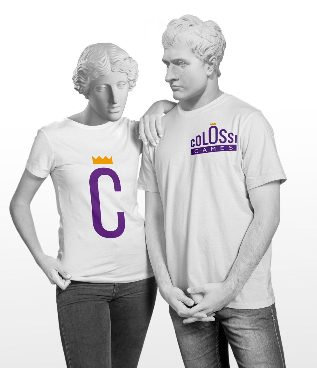
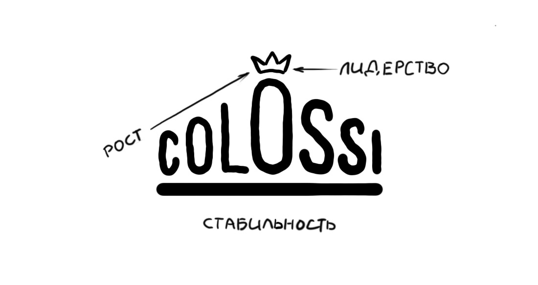
The logo concept is based on three components: growth, leadership and stability. Growth is reflected through the dynamic aspiration of the letters to the central «O». The crown serves not only as a symbol of leadership, but also acts as an accent, thereby simplifying the pronunciation of the word Colossi. The word Games is located at the base for a reason. It is the area in the company is the expert in, the basis on which everything is built.
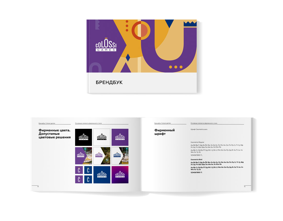
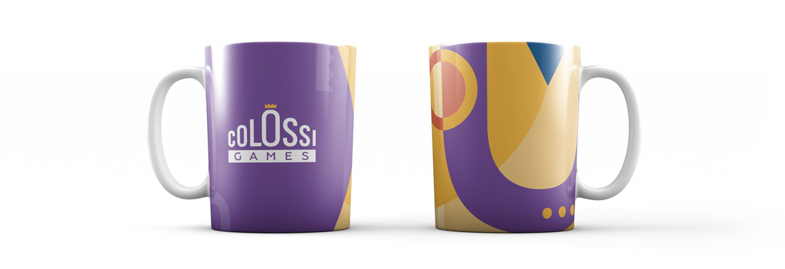
About shape, color and pattern
The logo is inscribed in an isosceles triangle — a stable, regular and stable figure. The main color used is purple, a symbol of wisdom, knowledge and confidence. The pattern is created from style-forming elements: the letter «C», crowns, enlarged letters «O»