Mobius Technologies
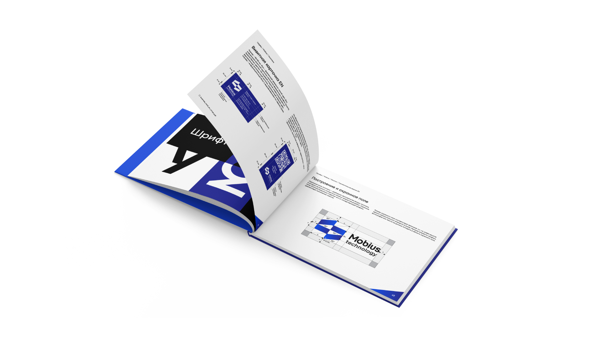
Many companies, continuously developing and expanding, outgrow their original image, and the need for rebranding becomes obvious. «Mobius Technologies» was one such company. The logo and corporate identity once developed for the startup no longer reflected the current market positioning and ambitions of the brand. Through our collaboration, there was born a logo that conveys confidence and stability, and at the same time innovativeness. Moreover, the logo reveals the conceptual connection of the company’s name with Möbius strip.
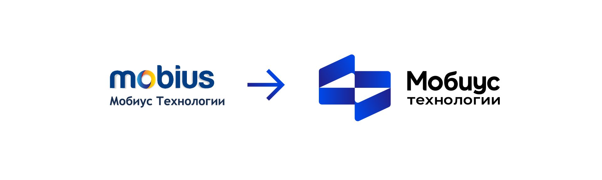
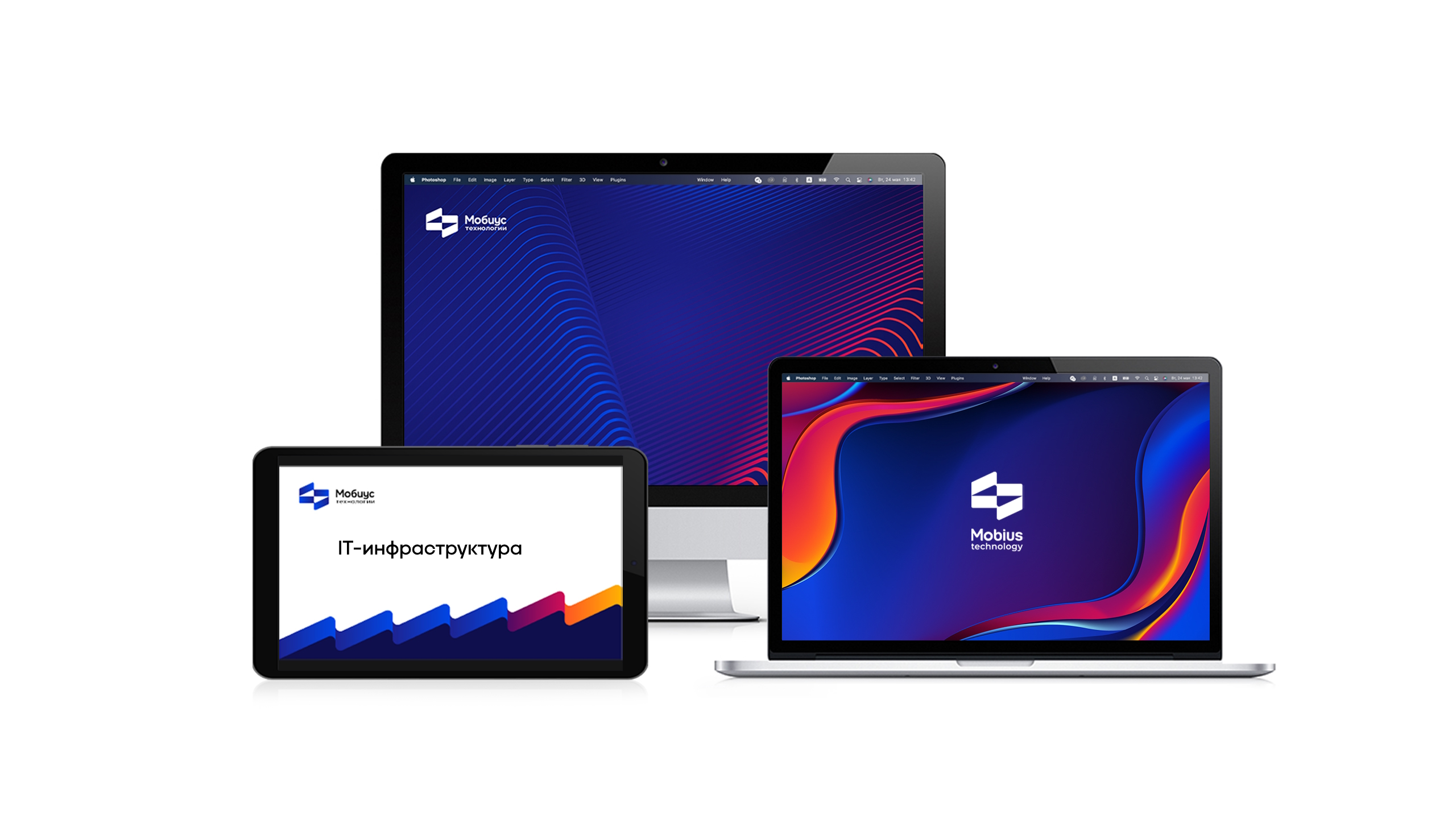
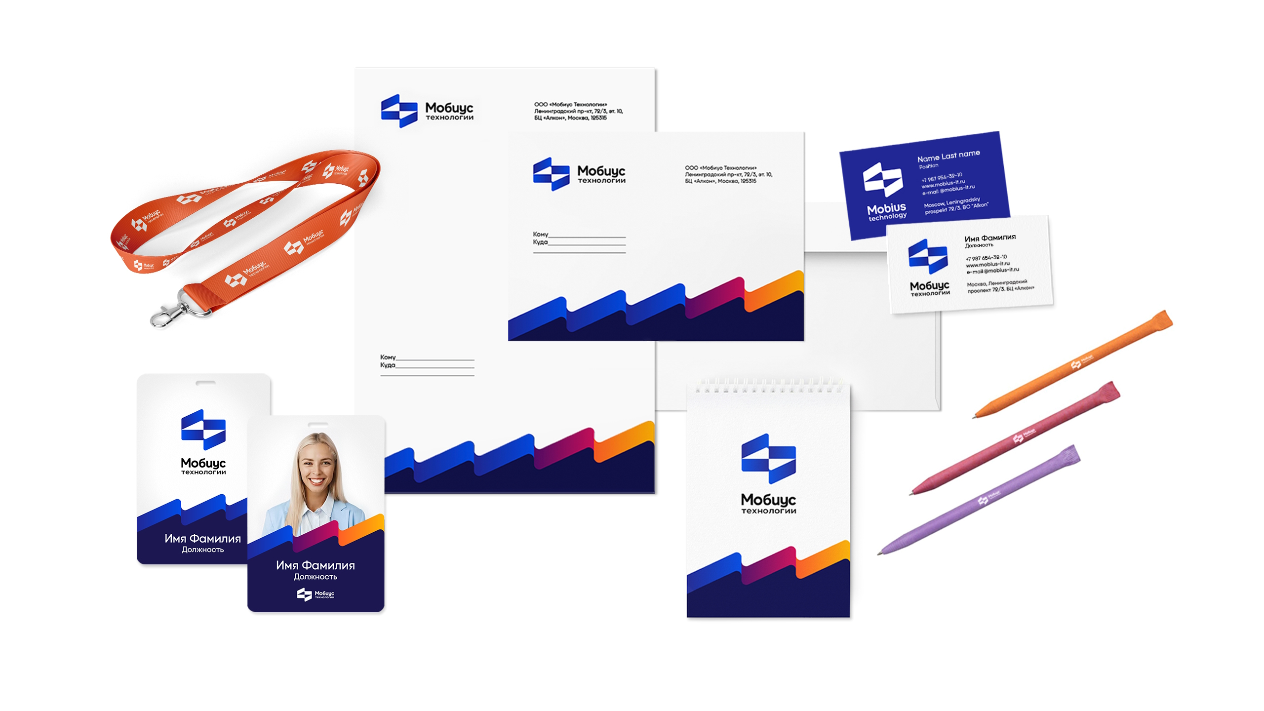
We developed a new logo, keeping the confident smart blue as a main color and added brightness and dynamics to it.
In addition, we selected a unique author’s corporate font, which shows the openness and client-oriented approach of the company. The resulting corporate identity is energetic, eye-catching and not giving a chance to go unnoticed.