Сancer Prevention Foundation
The Cancer Prevention Foundation is doing a huge, very important job. We learned that the Foundation needed help with branding through the repost of friends on Facebook, and offered our help. The problem really existed: the Foundation had several different logos at the same time, which brought confusion to the name of the Foundation, its slogan and subbrands it had. For the Cancer Prevention Foundation we conducted a strategic analysis, after which we did a complete rebranding of the main brand and all its sub-brands. Now the logo of the Foundation is made up of elements of the logos of its projects, which emphasizes the importance of each of them.
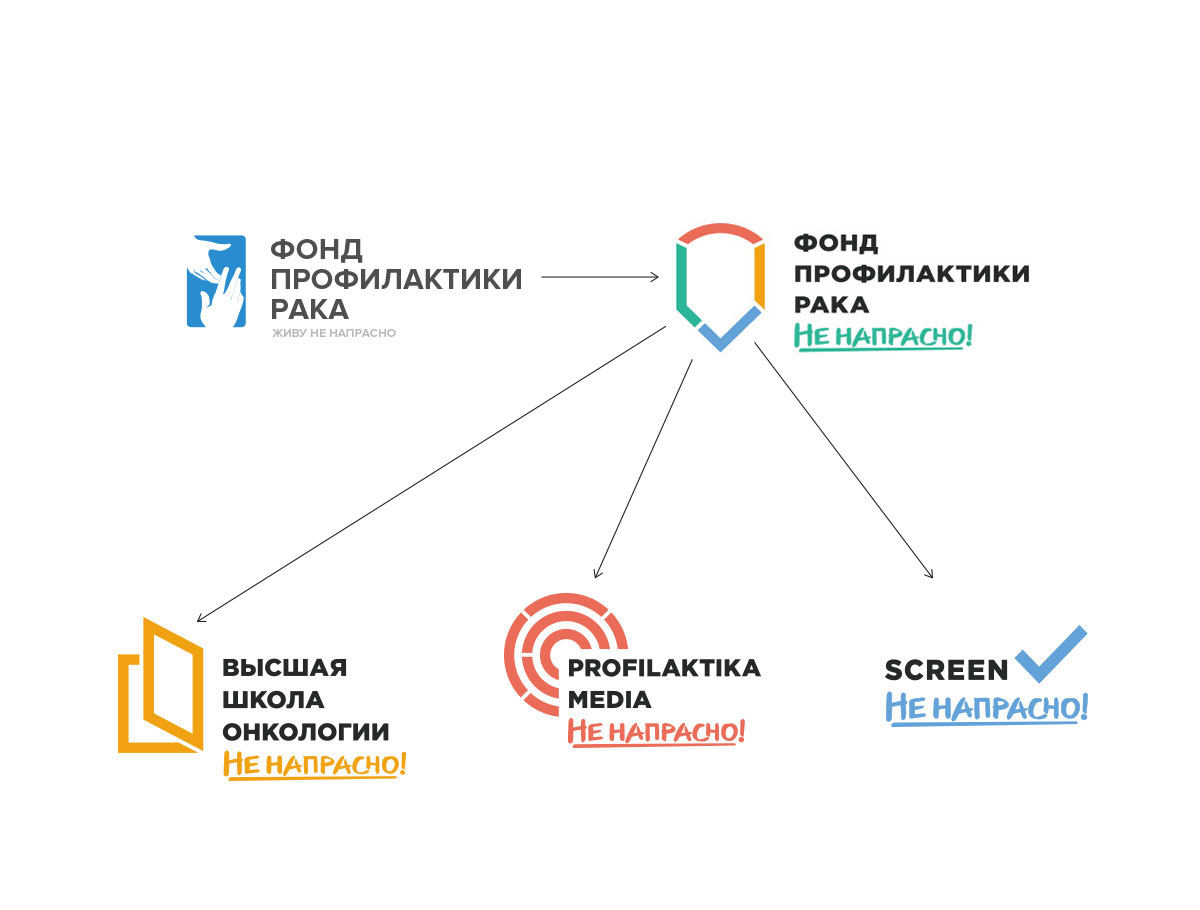
Now everything has become as clear and transparent as possible. The phrase «Not in vain» as a name and at the same time the slogan «married» all sub-brands, helped to create a real umbrella brand. Now any activity supported by this phrase in corporate spelling is automatically correlated with the activities of the Foundation. So, for example, it was easy to figure out what to write on t-shirts for a charity run: we simply wrote «I’m not running in vain», and everything immediately became clear.
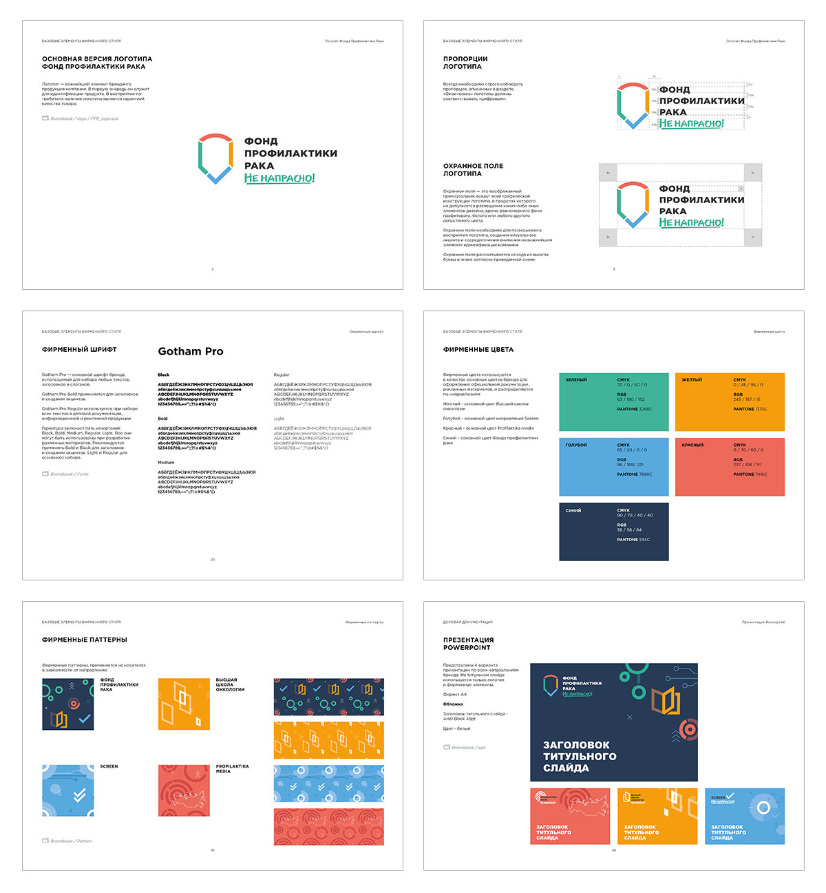
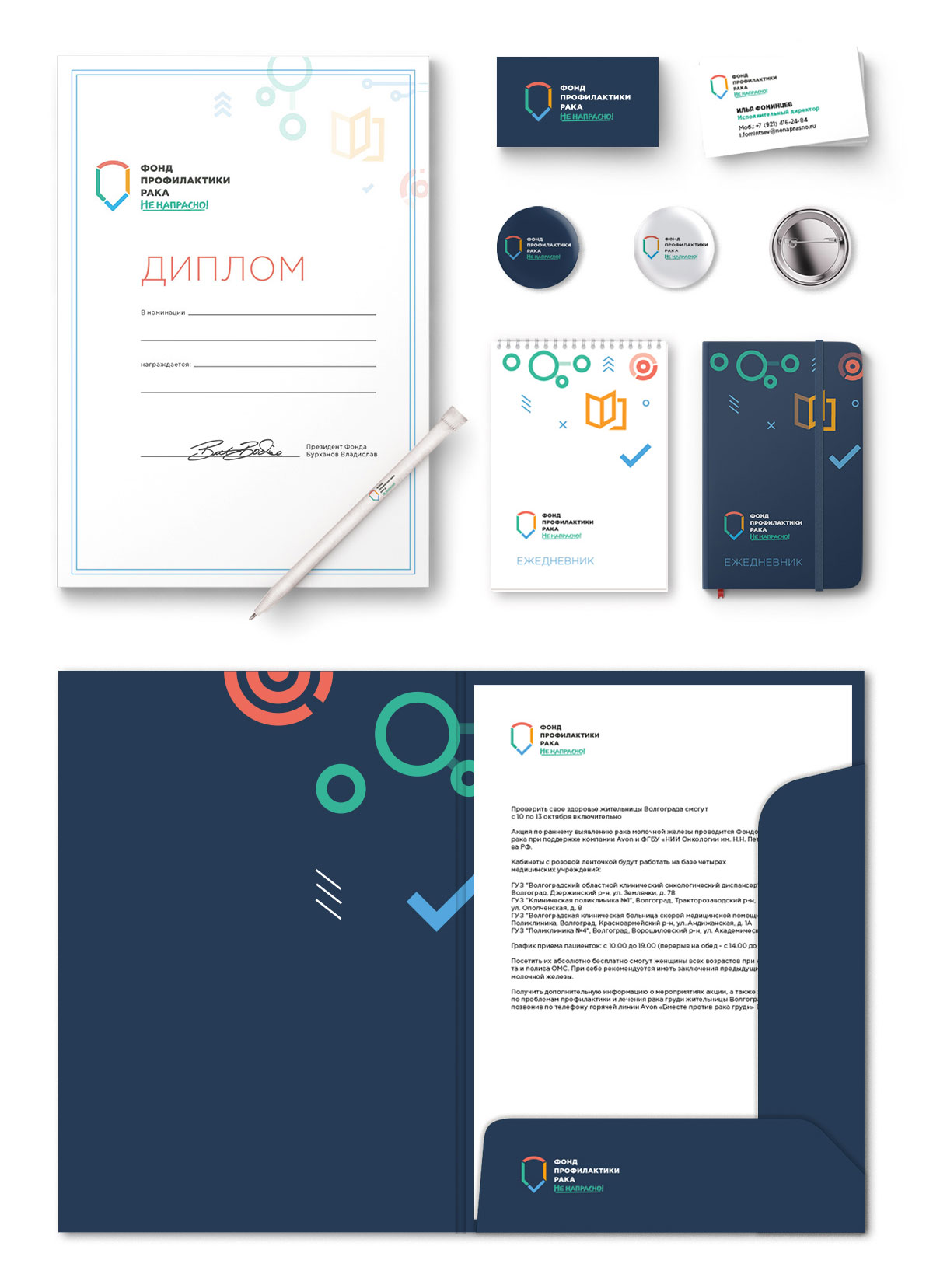
For the convenience of working with the new corporate identity we have developed a full-fledged brand book
As part of the project, we worked on the design of the fund itself and its Profilaktika.Media project. Navigating useful materials has become even more convenient
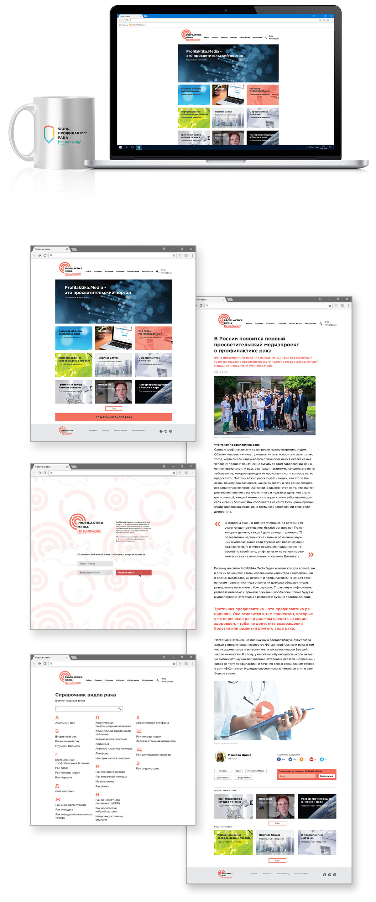
A clear interface improves the perception of the material at times
This work was the first charity project in the history of the Osoka branding agency
These days this brand has grew up a lot and changed its name to Medical Solutions Foundation, but the main design remains the same