Rancho Rikon
Lisa Osokina, creative director of the branding agency OSOKA:
«We received the usual request: «Hello, you were recommended, we need a design for our brand. We have a dairy farm and a cheese factory». We agreed to meet on the same day, for a meeting. I left my home office, dressed up nicely and put makeup on, and brought my laptop to show our portfolio. Already in the cab, I learned from our link, that the client I was going to meet is blind. There were many thoughts racing through my head, from why I put make-up on, to how I would actually coordinate the project».
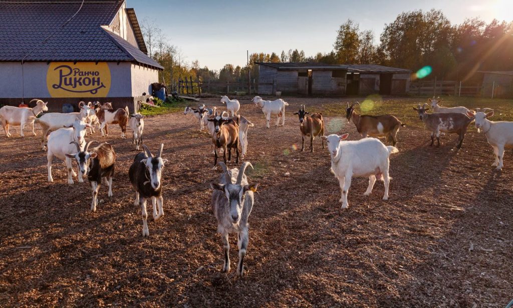
German Kavun, the owner of Rancho Rikon, is a truly unique person. Being an entrepreneur in Russia is not easy, but if you are a foreigner (and German came to Russia from Canada) and are completely blind, it is a real stunt. German bought a farm in the Leningrad region and first made a home there for the elderly horses who had finished their careers in sports and retired. Then he and his wife Margarita started cows and goats on the farm, they learned the secrets of cheese-making for a long time, and now they produce and sell incredibly tasty cheese of very high quality. The main customers were dacha farmers from neighboring communities in the summer, and buyers from several expensive restaurants the rest of the time. However, seasonality had a very strong influence on business performance.
Lisa Osokina:
«Our meeting, contrary to my expectations, was incredibly productive. German has an excellent understanding of business, marketing, and people. German and I walked to the point of sale, he held me by the shoulder and told me about his brainchild. There we discussed what he would like to change in the design of the storefronts, as well as what needed to be done in terms of branding. It wasn’t easy to discuss design preferences, but we agreed on a project»
German Kavun:
«Despite my vast experience in business, doing business in Russia blindly is not easy. That’s why you learn to feel people in a special way, to understand and anticipate them. When I talked to the OSOKA team, it immediately became clear that the team has a very similar approach to mine, they are professional and honest, and that’s half the job these days».
First, a communication strategy was developed, which helped determine the formats that would need to be created in order to expand the audience, reduce the impact of seasonality on business performance, as well as to convey the right message about the nature and values of the brand.
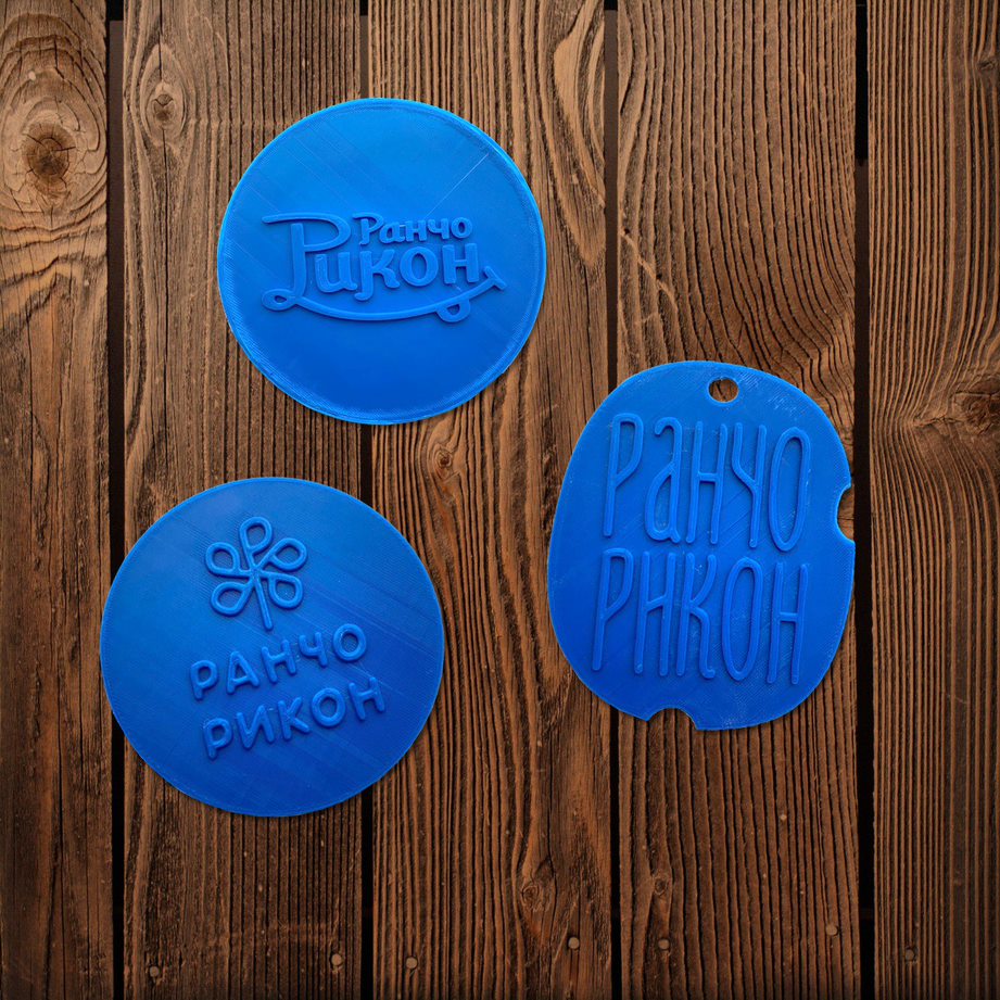
Then OSOKA team started to work on the design of the new logo. And immediately there was a question: how to present the result? German immediately said that his wife Margarita, who is an excellent judge of animals and cheese, and who can see, would be involved in the decision, evaluating purely the visual component, but the final word, based on whether the logo conveys the right message, is up to him. At that point, a surprisingly simple idea came to mind: to use a 3D printer that had been standing almost idle in the agency’s office. Agency representatives brought versions of the logo in their physically tangible form to Rancho Ricón.
German Kavun:
«I was shocked and deeply moved. I do business in different countries, but no American or Canadian agency had ever thought of such a thing. Through this simple decision, a blind person was able to understand what kind of logo his business would have. I see in this subtle and profound approach true creativity and real respect»
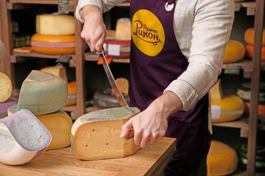
German chose the cutest and somewhat cheeky option. He wanted the logo to be very simple and democratic like himself, friendly like the animals on the farm, and telling about the taste of the cheese the cheese factory produces.
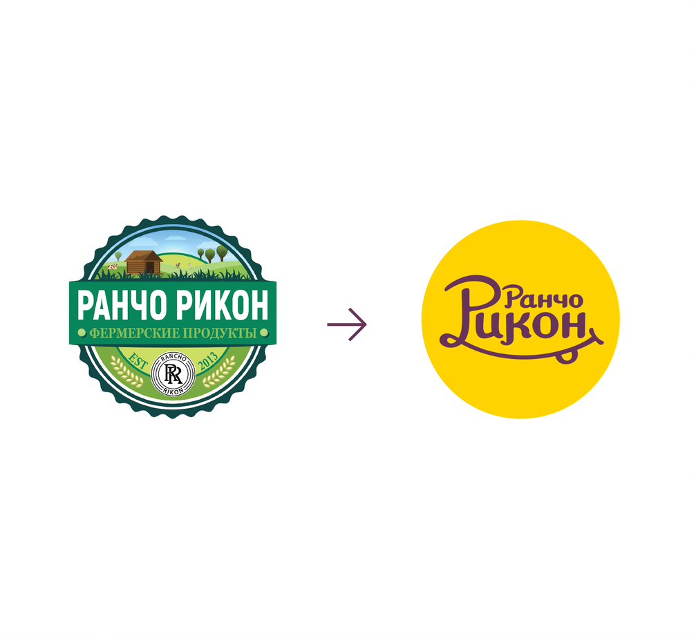
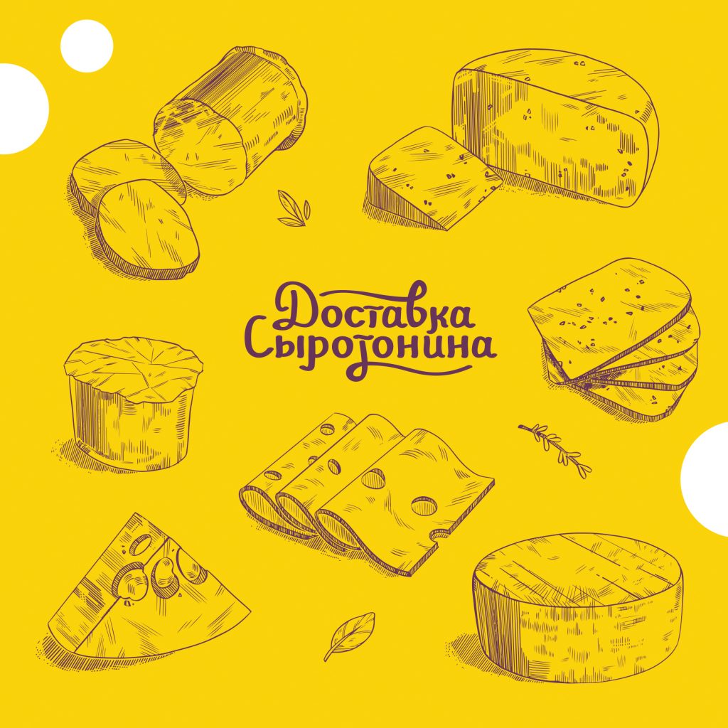
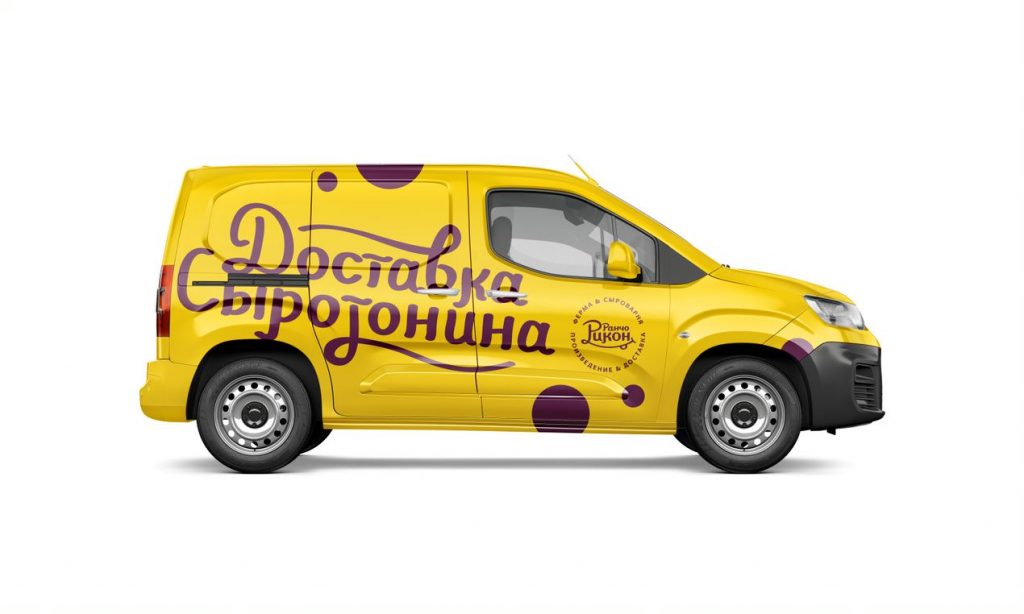
The color choice was quite simple: yellow is the color of cheese and sun, and the purple color was inspired by one of the most delicious cheeses that Rancho Ricón produces — Murcia al Vino — a goat cheese that is soaked in wine, which makes it covered in an edible burgundy-purple crust. The color of this crust became the second signature color.
Next, the designers developed a branded pattern, hand-drawn several types of cheese, as well as branded spelling of the cheese factory slogan, which is used both on the website and in the store’s design.
 |
 |
In addition to the pattern, the basis of the corporate identity is the theme of cheese holes. The theme is not the most original, but the most understandable and tangible for the brand owner, who can «feel» this corporate identity.
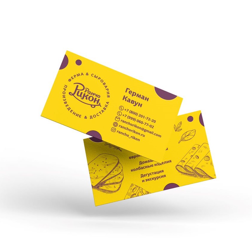
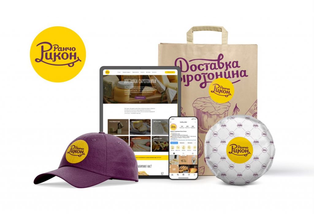
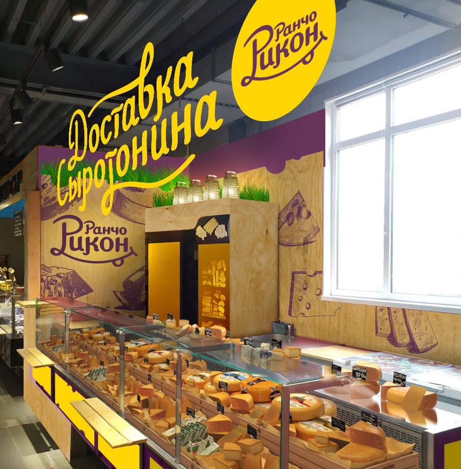
Then we developed the design of product packaging, uniforms for the store personnel, as well as the design of the sales outlet itself and branded vehicles. This was followed by the development of a simple company website, the design of social networks and some printed materials.
German Kavun:
«This experience has been surprisingly non-traumatic. I’m very happy with the result because I can see how our loyal customers are responding to the new brand. This season has been the most successful in Rancho Ricon’s history, and thanks to the website the guys made and the cool design of all the materials, we’ve got a lot of new loyal customers. Now it’s much easier to communicate with large restaurants, because our product is easier to perceive. And most importantly, the new logo improves the mood».