Marvel Distribution
It’s not the Marvel you’re thinking of, but Marvel Distribution has plenty of superheroes, too. On the eve of its 30th anniversary, it was decided to rebrand the logo and corporate identity, as the company was evolving, improving, and it was time to show it off.
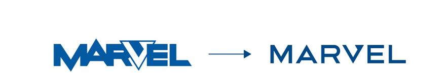
The old logo was recognizable among partners and vendors, so the changes had to be tangible, but not drastic.
The rebranding was intended to convey that the company has become more modern and service-oriented, has a large product portfolio and provides a variety of services. The main difference between the new logo and the old one is readability. We defused the letters, bringing them to one text axis, now the «v» does not interfere with the readability of the company’s name. The logo is based on a system of horizontal and diagonal lines with equal thickness of the stroke.
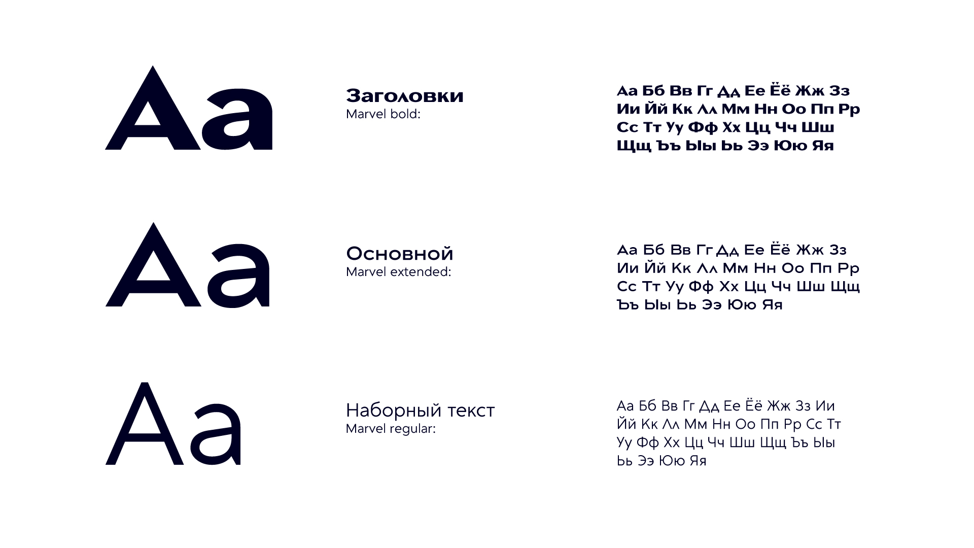
We realized that the company could use its own original font for easy communication.
We developed the Marvel font in three headsets — bold, extended and regular.
A distinctive feature of the font is that its construction follows the same diagonals used in the logo.
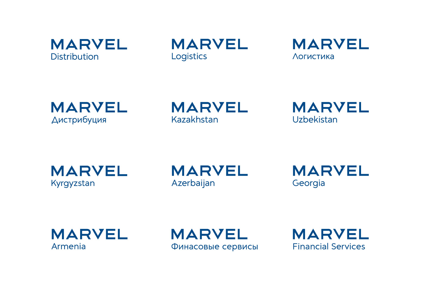
In addition to the basic version, which is used when it comes to the company’s business as a whole, we have developed extended versions of the logo for individual lines of business or regional offices (Marvel Logistics, Marvel Kazakhstan, etc.).
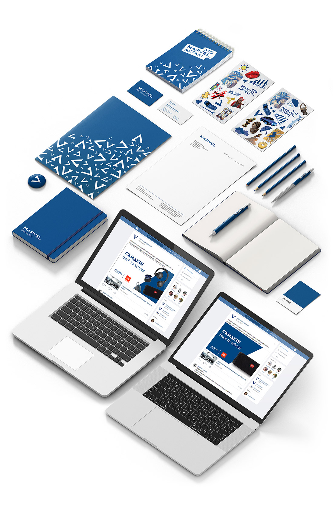
We worked out additional elements of corporate identity, such as the corporate pattern, dies, and also showed them on different media.
In the end, we developed a brand book, which clearly spells out the rules for using the new corporate identity.
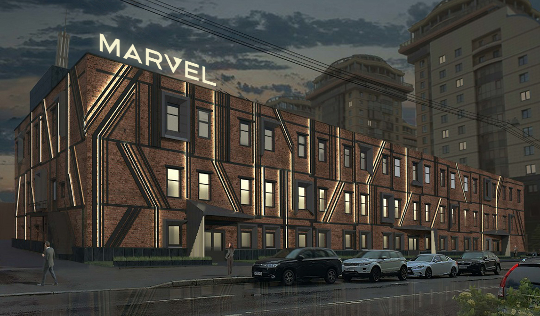
We are confident that the new corporate identity will definitely help one of our longest-standing clients, Marvel Distribution, become even more successful this year. And we will soon show you how we transformed the company’s office with bright, unusual techniques. Stay tuned.