Baltic Weekend
![]()
The logo is based on the idea of creating a common space for communication, a common field for the best cases, a common frame for portraits of the best in the industry. The frame is a dynamic element: it scales and changes proportions for convenient use on different media.
The blue color of the frame symbolizes the Baltic Sea and the freedom of communication. The fact that the frame is not closed symbolizes the expansion of boundaries. The frame is also meant to serve as an element that focuses attention on what is important. The writing in full or abbreviated version is always placed not in the center of the frame, but in its lower right corner — this decision suggests that the Event is not an object of attention, but a space in which the most interesting ideas are expressed, each of which Baltic Weekend is ready to subscribe under.
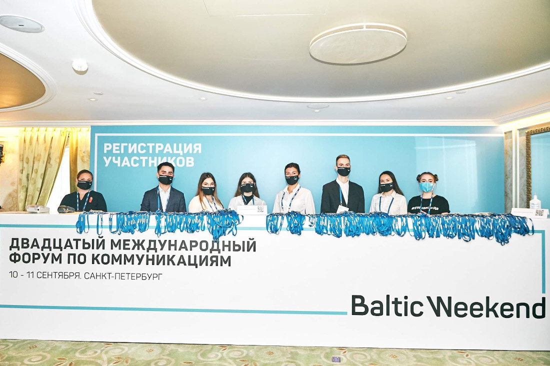
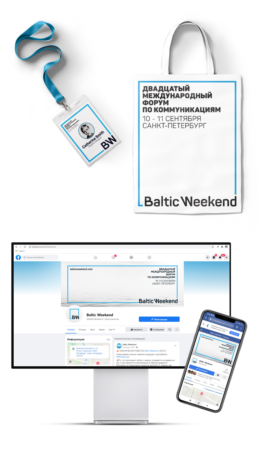
Registration zone design
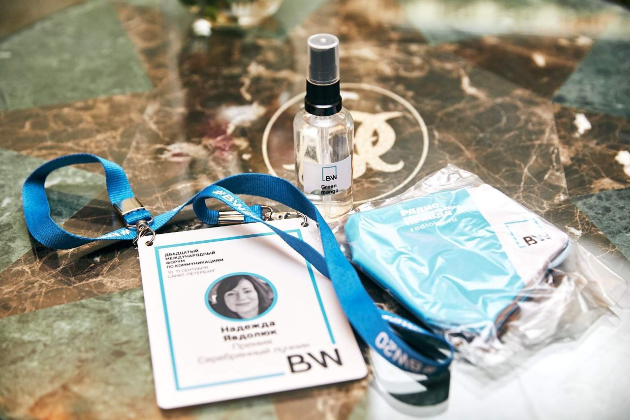
Each participant was given a nice kit
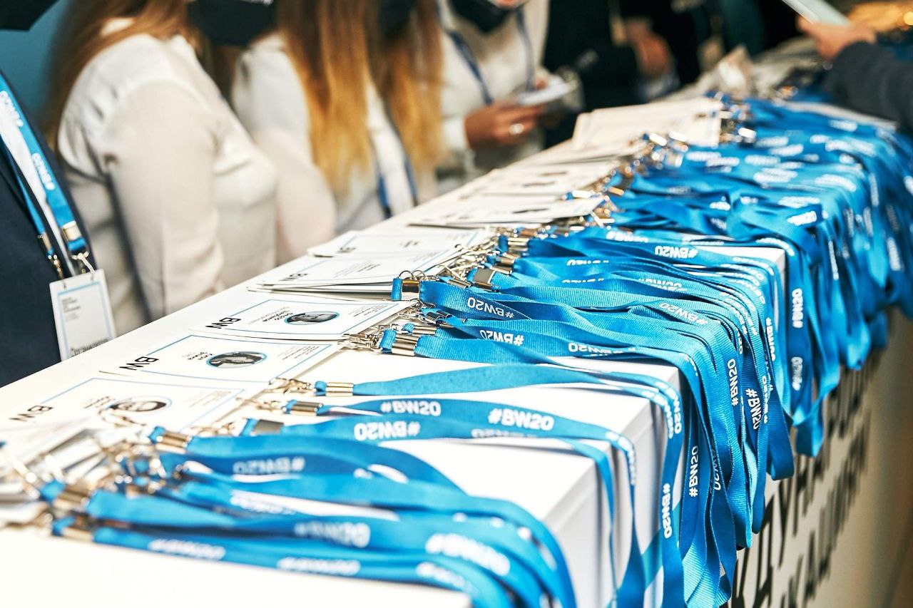
Participant badges and ribbons
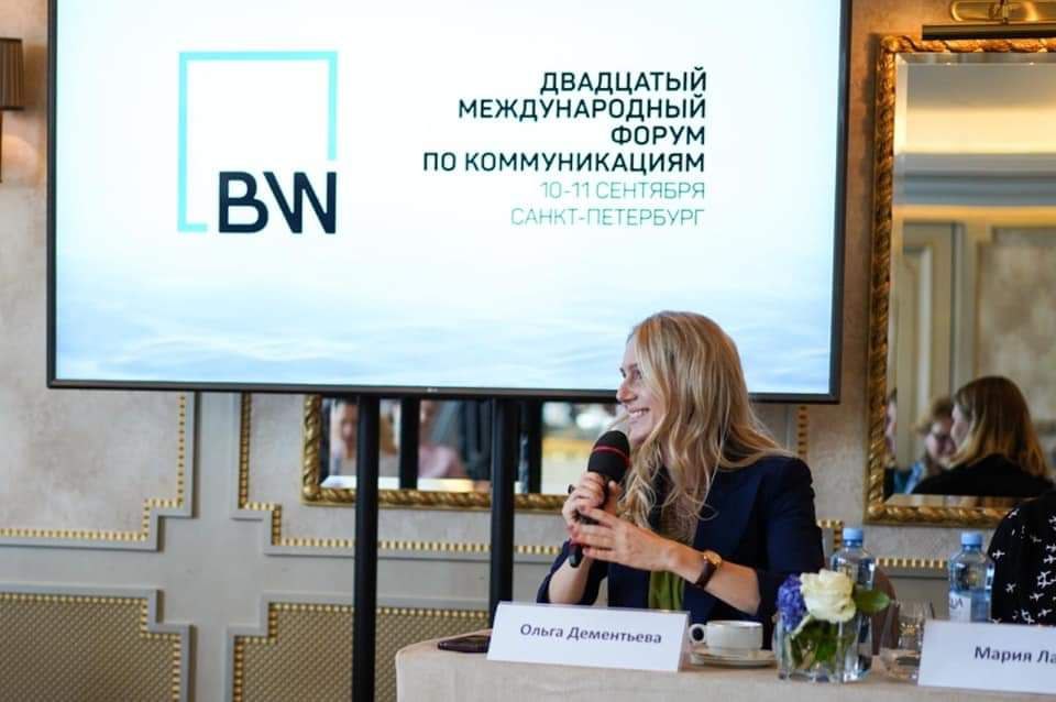
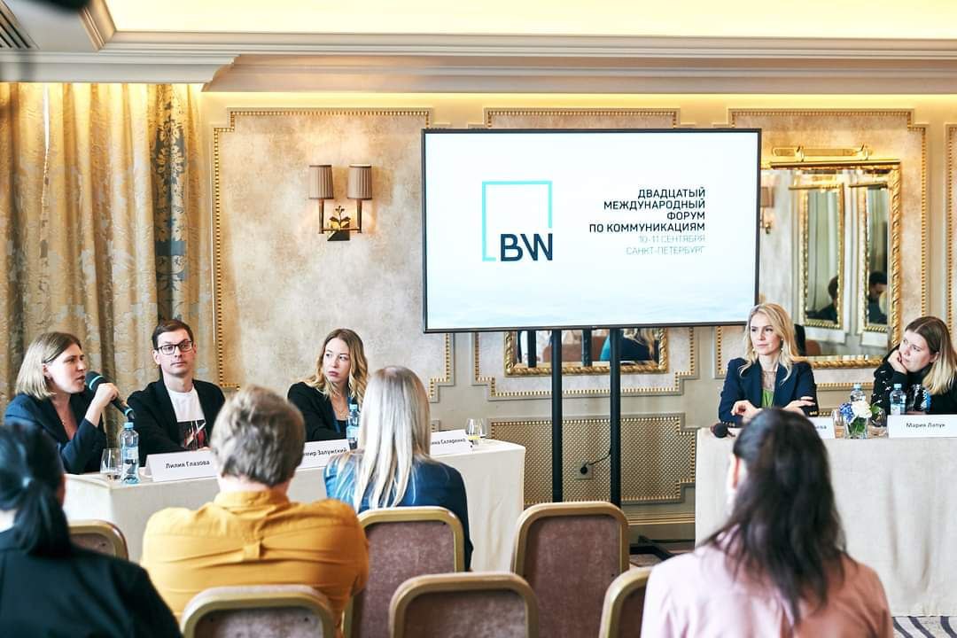
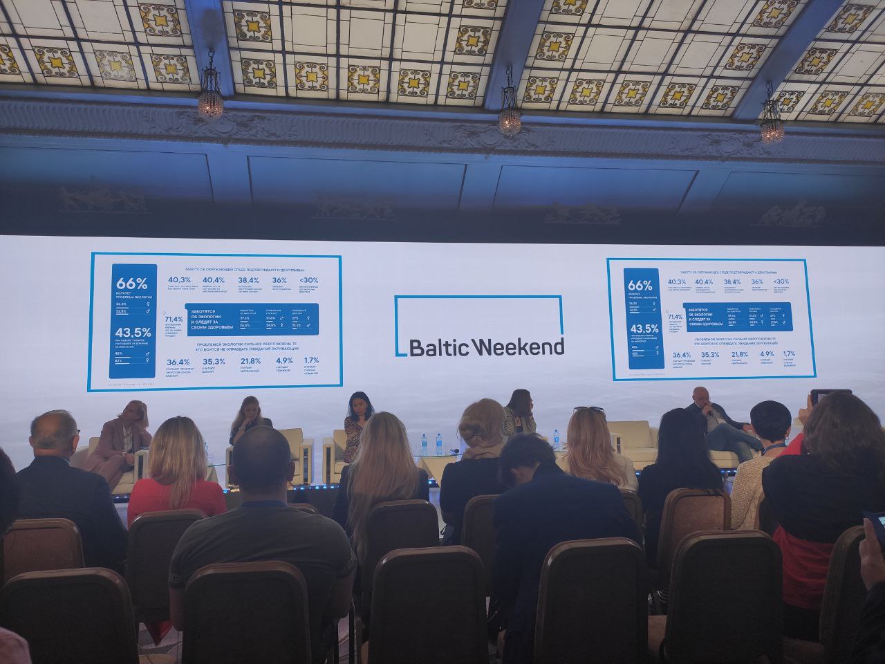
Screen design in the discussion room
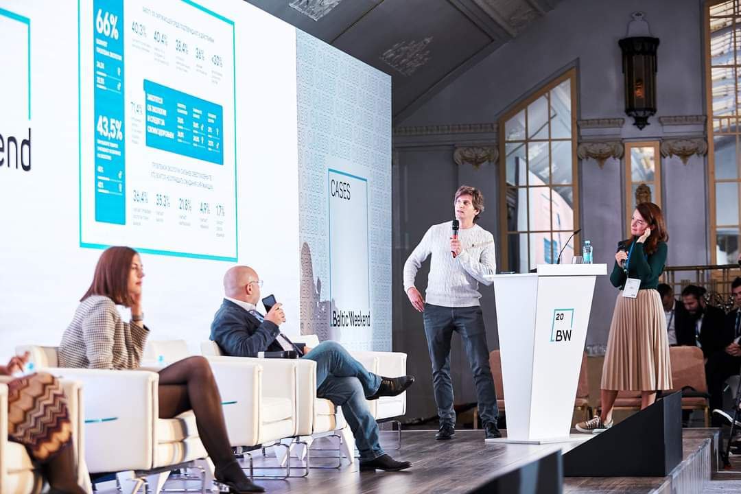
Decorating the main hall
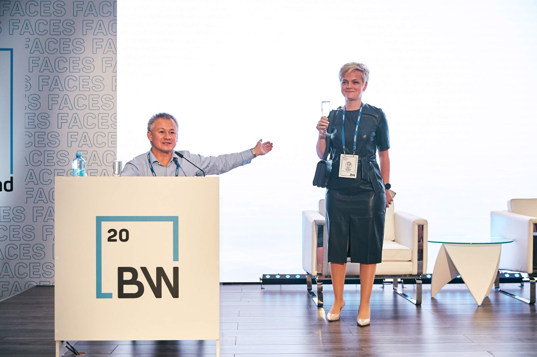
And this is the moment when Andrei Barannikov introduces our Creative Director, Lisa Osokina, to the guests of the Forum. Thank you for your trust, Andrey.