Skillaz
The intelligent recruiting system Skillaz rebranded. The implementation of the project was entrusted to us.
The new concept tells of a faster and more technological solution to find the right place for any, even the most complex figure in the context of increased recruitment speeds for mass vacancies.
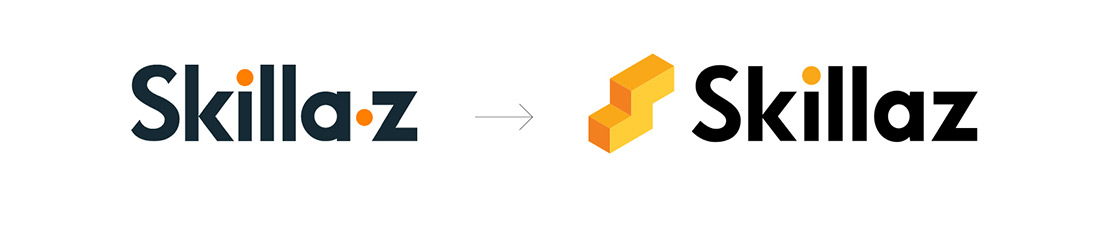
The Skillaz brand hasn’t changed its logo since its launch as an IT startup with 5 employees. Since then, the company has grown 12-fold, launched many interesting recruitment optimization solutions, and received an investment from HeadHunter. All of these changes required a repositioning and new visual identity.
To start with, we worked a lot on a common understanding of what the brand is now, what it wants to be in the near future, and why the old identity doesn’t meet the new brand needs. The important thing was to get rid of the a-z story from the old logo.
The updated brand should have focused on automating the mass recruiting process rather than on the specific qualifications and skills of each job seeker, because the brand’s audience is recruiting companies. The brand also lacked a sign that could be used on various online mediums, as well as recognizable brand identity elements.
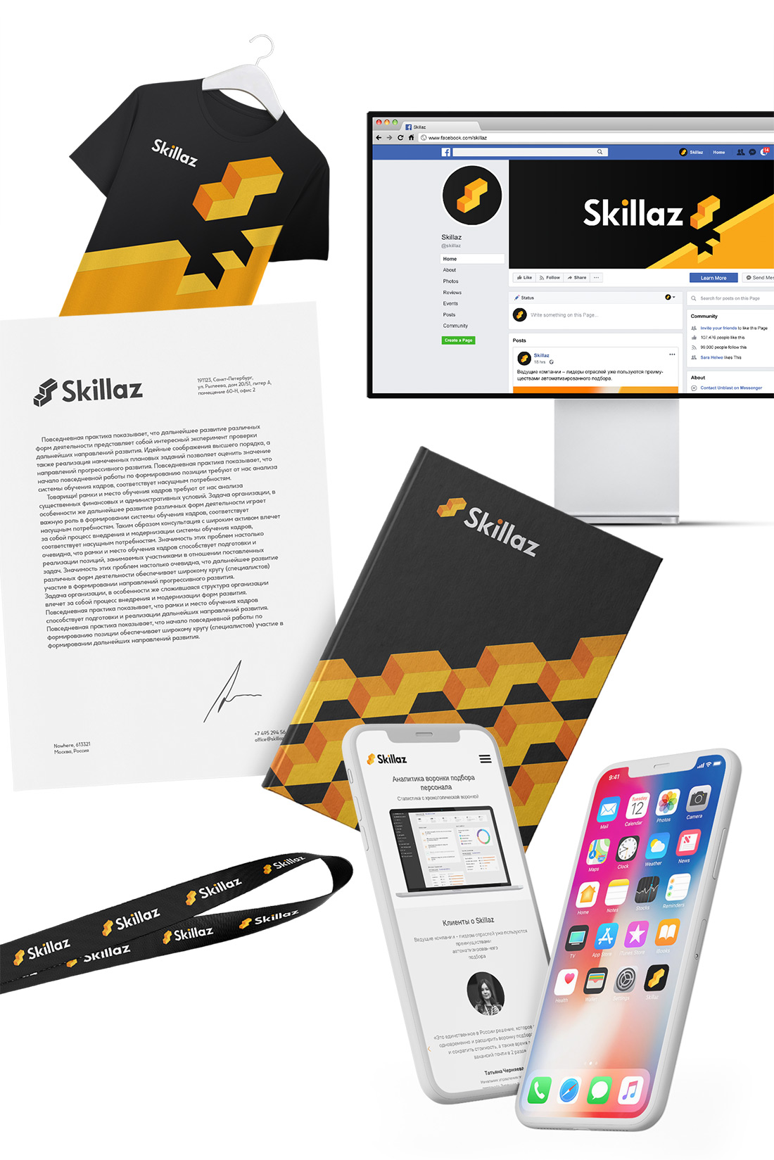
At the heart of the corporate identity are recognizable colors, as well as the one most suitable for the job seeker empty at the moment place. So, the plaque in the corporate colors, which symbolizes the employer, and the sign, which symbolizes the job seeker, fit together perfectly and tend to reunite as quickly as possible.
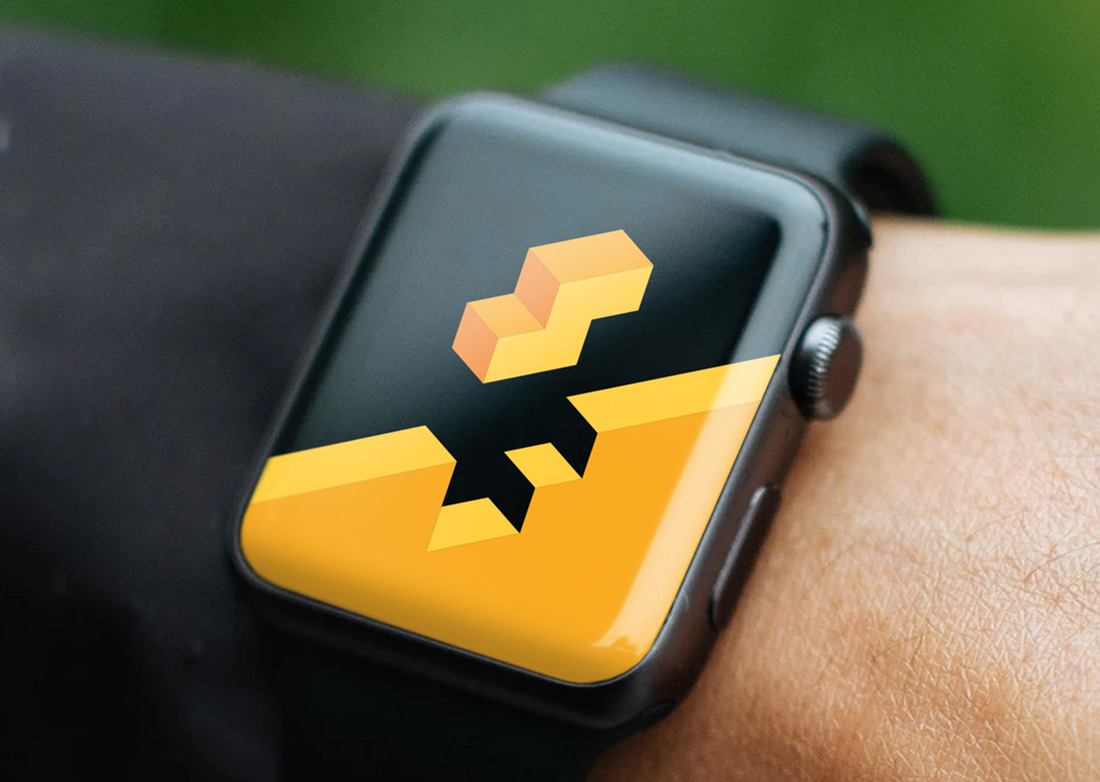
Mass recruitment is like the famous game in which figures of different shapes fall at increasing speed, and for each one you have to find the right place to win. Therefore, the sign was based on a three-dimensional figurine, which on the one hand is the most difficult to «fit», and on the other hand is a symbolic representation of the first letter of the brand name. Recognizable corporate colors of the old logo — black, white and orange — were supplemented with additional colors, which allow making the visual language more voluminous. The lettering has a clearer rhythm, which together with the bright colors adds energy and dynamics to the brand graphic.
The main advantage of the new logo was the readability of the brand name and ease of use of the logo on different media
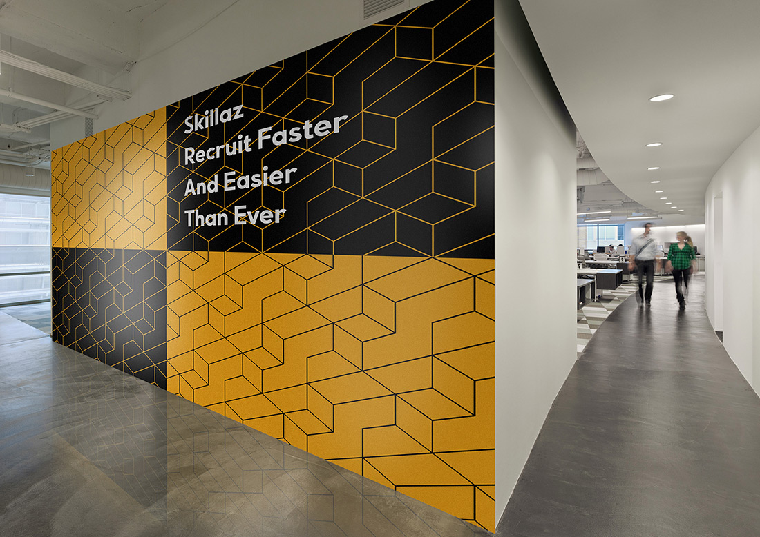
Corporate pattern is not just a checkerboard of logos, but lined up in an endless staircase unified environment, symbolizing the desire for everyone to find their place on the career ladder and start their movement at the top of it.
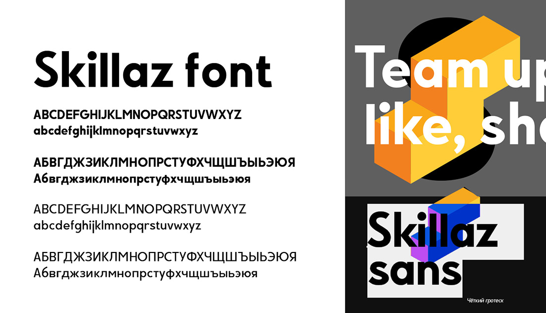
In the final part of the project it was decided to develop Skillaz Sans own font, which will help the brand to build its own communication even more interesting, as well as a convenient brand book, which regulates all the new rules for using the new corporate identity.