Zero IT
The head of an IT reseller company wrote to us on Facebook after we rebranded one of his partners. It turned out that Artem had been following us (in a good way) since our other branding project in the IT sphere. Artem came in for a new logo
Talking about his company, which supplies various IT hardware and software, as well as outsourcing, installation and configuration services, he mentioned the name Zero IT.
How did it happen? As it usually happens with the good guys: the name was invented and seemed nice at the very beginning of the business, but the company began to grow and expand so rapidly that there was no time for branding. But one day there comes a moment when you have to bring the brand and the real situation in line with each other.
A company that solves clients’ acute problems, acts as a reliable partner for its clients, grows and gets stronger cannot be called «Zero». But how? To determine the vector of further development the guys were helped by our strategy to bring the updated brand to the market
We analyzed our competitors, identified several important groups of target audiences, and found strengths and weaknesses. Of course, we could not ignore foreign markets, as the IT sphere is developing very fast there. Based on the analysis of the data we found, we figured out how to help Zero differentiate itself from its competitors, and what to shift the focus to when creating a new image for the company.
Renaming
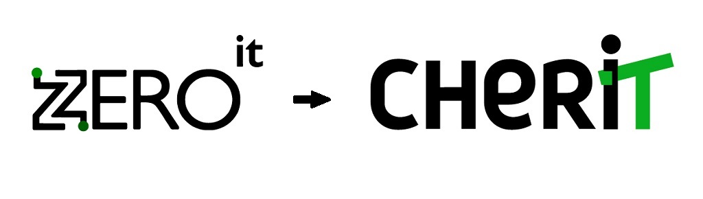
The strategy helped define the vector for the name and logo, as well as for communication in general. The main messages were friendliness, support, and mutual understanding. Of the many options we developed that reflected the main message, the name CherIT was chosen. It combines the French «cheri» (meaning «dear to the heart», «cherished»), consonant with the word «share», as well as with the English word «cherish». In addition, the name has «IT» in its composition, defining the scope of the company’s activities.
Logo
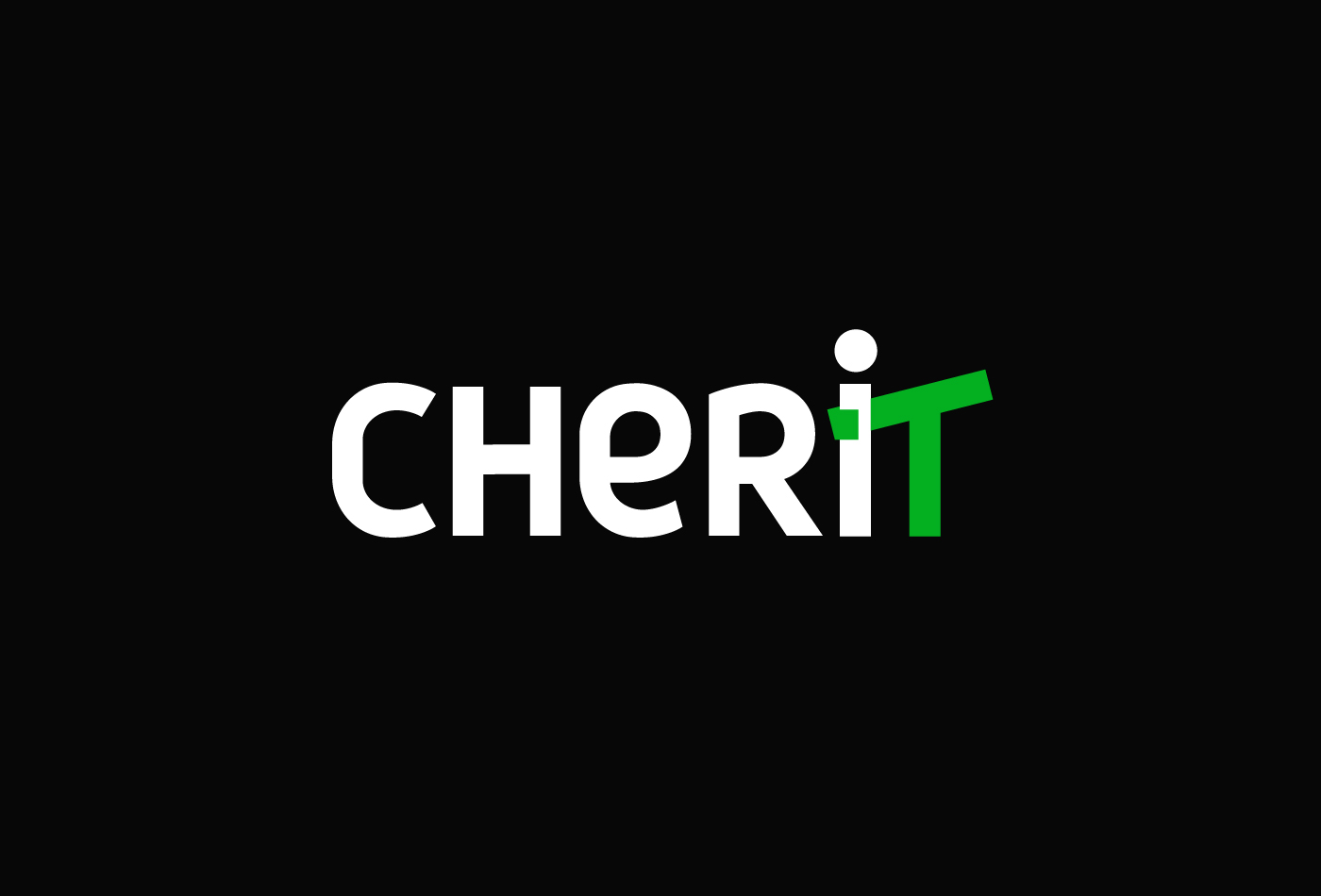
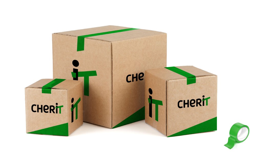
The logo had to tell the story of CherIT employees’ support, help and friendliness to their clients. It was still important to highlight the letters IT in the name so that when you first contact the brand it would be clear what it was about.
Leaving the accent color green to preserve continuity from the past corporate style, we chose a more current shade and highlighted the cherished letters with it; the detail that made this story complete was the letter «T» carefully embracing the «I». A rounded and friendly Din Pro font was chosen for the writing. The logo could be used in full spelling or just the sign consisting of the last two letters. As soon as the client saw this logo, they immediately chose it from a number of others. We immediately fell in love with this incredibly friendly option too, so we were happy with the client’s choice.
Corporate identity
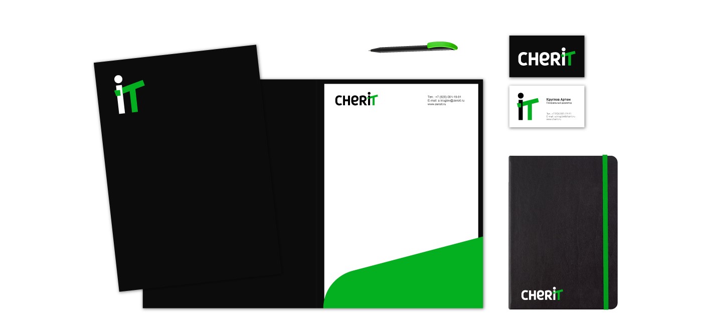
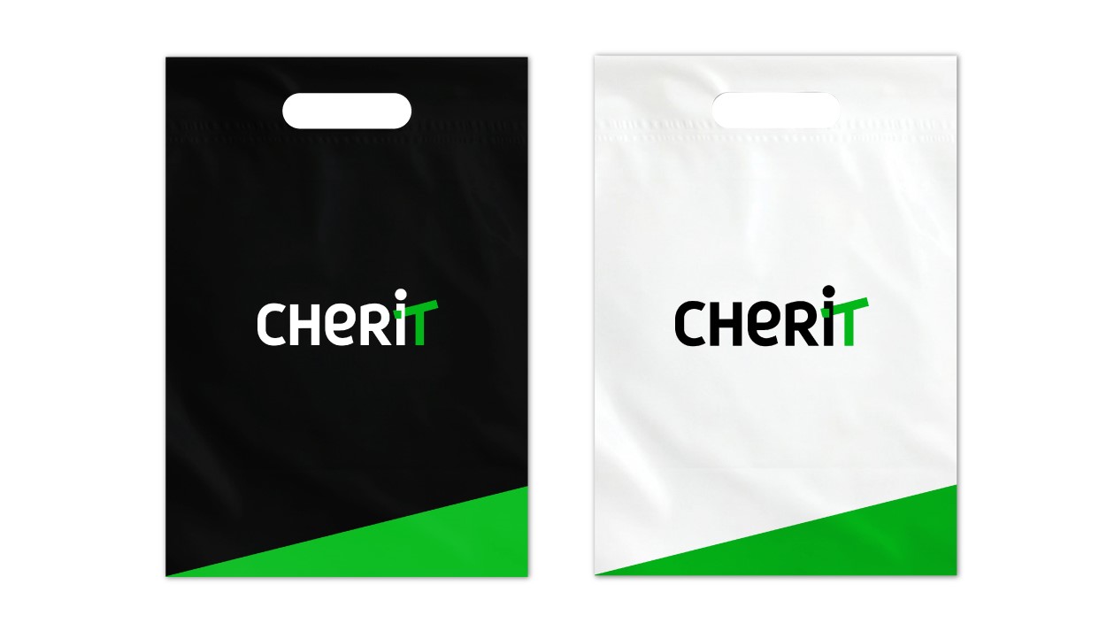
The entire corporate identity is based on the full or abbreviated spelling of the logo.
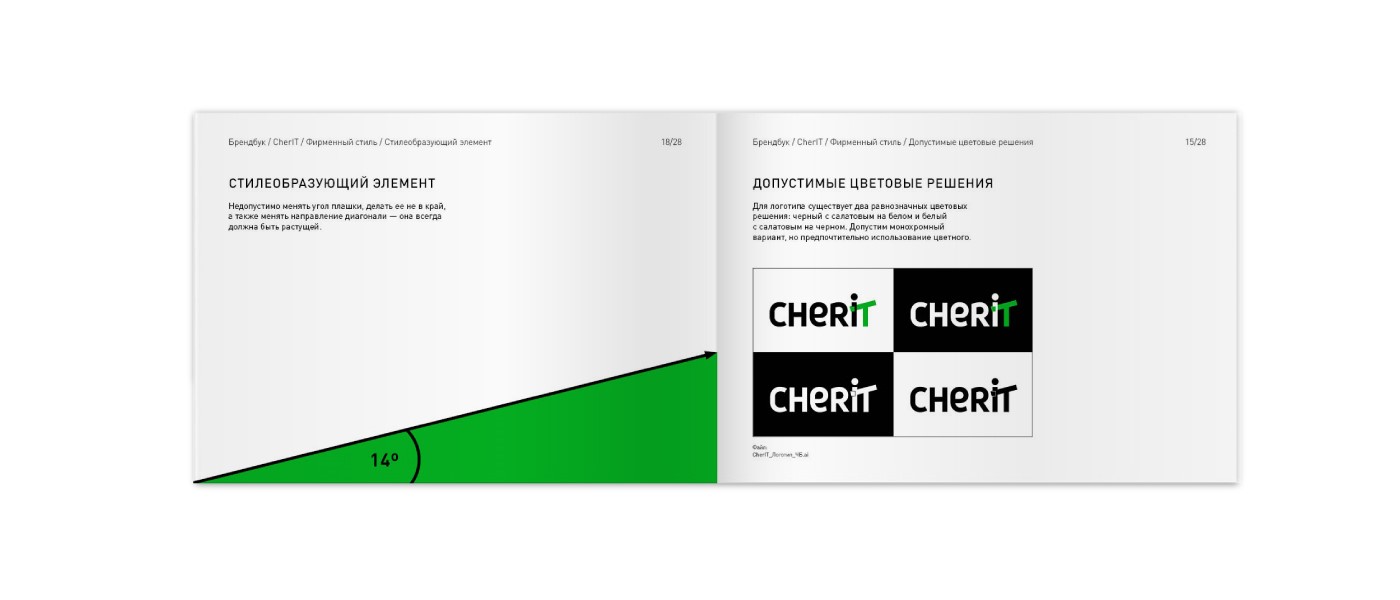
This diagonal as a symbol of company growth repeats the slope in the letter T and is one of the fundamental elements of corporate identity.
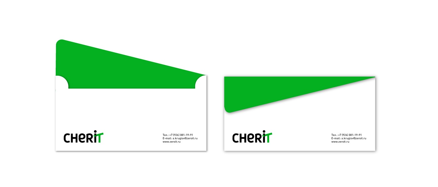
The design of the media is very minimalistic, but at the same time bright and fresh due to the rich shade of green.
 |
 |
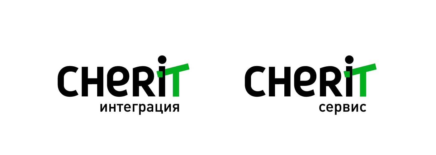
To identify related directions, we suggested using a descriptor written in the same corporate font.
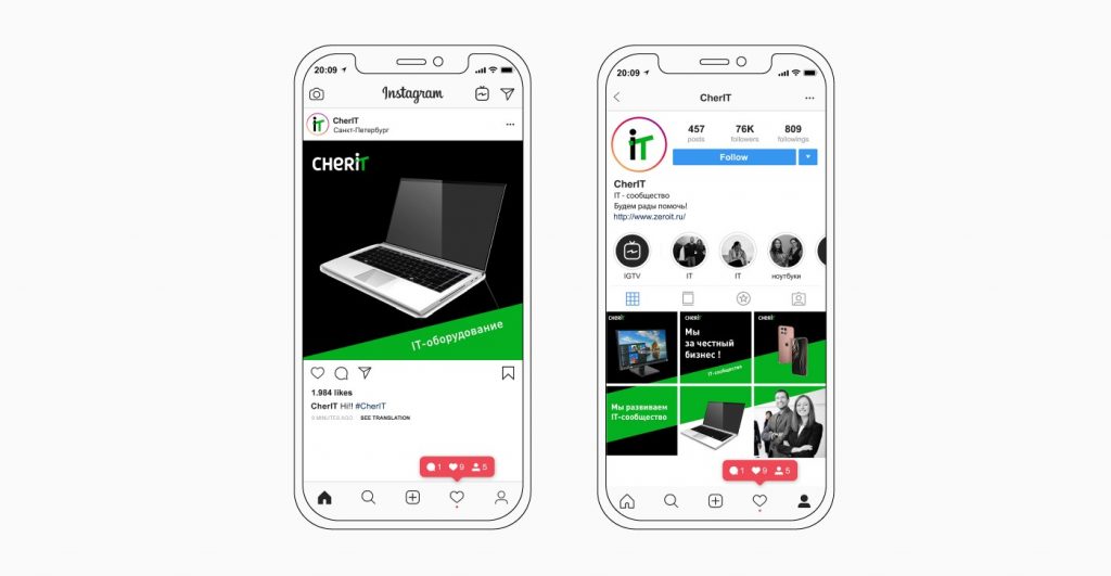
Social media design
For social networks, it is optimal to use only the sign as an icon. It’s easy to read, and thanks to the brand colors, the profile won’t get lost among the others. Also for the design, branded green bars at an angle can be used very nicely. They liven up the images, and allow to create different combinations of posts.
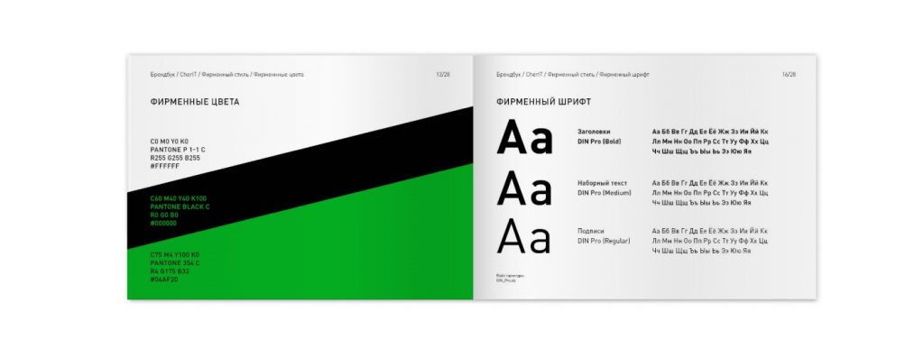
At the very end, as always, we developed an easy-to-use brand book, in which we recorded all the rules for using the new corporate identity.
Such a quick and clear coordination of both the name and the logo is not always the case. In this project, of course, both the strategy and the mutual understanding between the client and the agency helped. Everyone was on the same page in the process of cooperation, and now we are equally proud of the result.
We also brought in our longtime partners, who were able to design an online store with over 50,000 items in record time. We also took care of the website design