Nina Boer law firm
In terms of messaging, the new brand had to talk about reliability and protection, but at the same time not be boneheaded and boring, but modern, stylish, expert and creative, like the office team itself. Most interesting was the request for a corporate color. This may have been one of the first law offices to dare to move away from the standard shades of blue for the legal industry. Nina Boer said it all: I want pink!
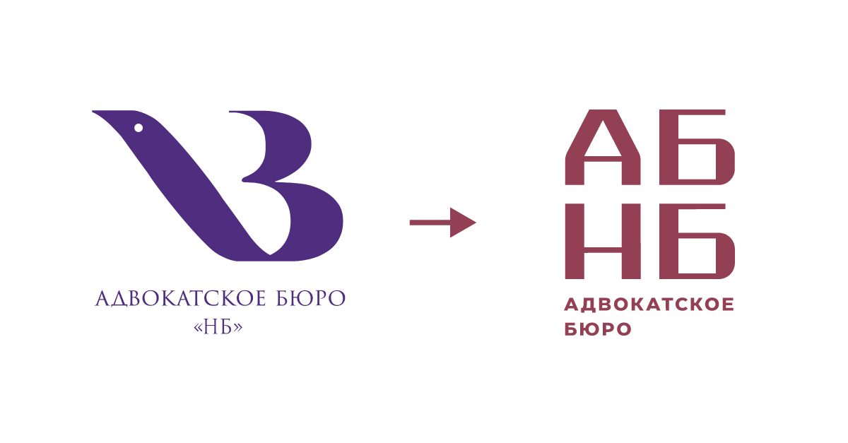
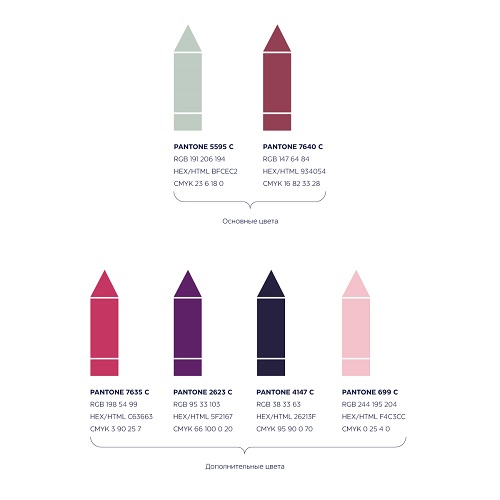
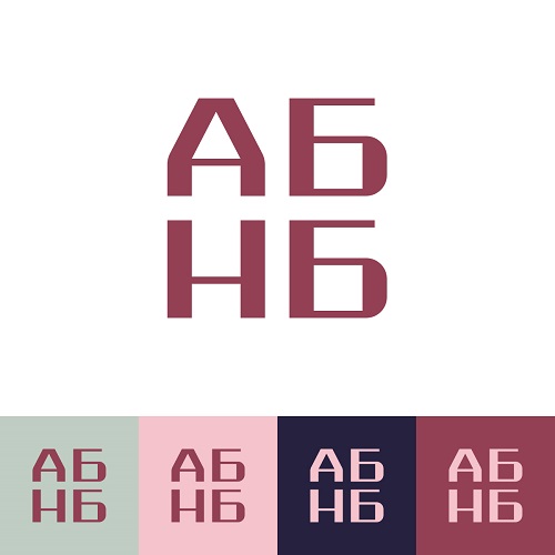
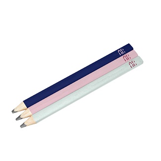
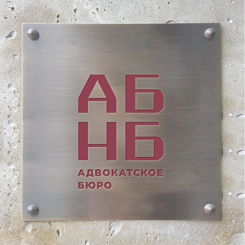
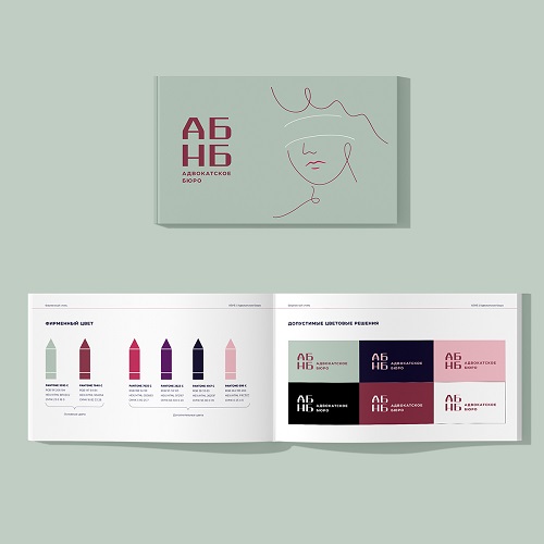
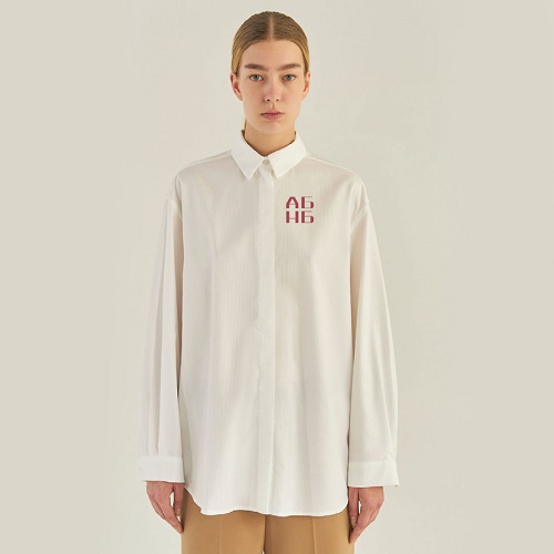
The new version of the logo is designed to emphasize that on the one hand, you can rely on this brand, get confidence and reliable protection, but on the other hand, it is the brand of a strong modern team, which is able to think outside the box. A pencil, which can be discerned on the counterform between the letters A and N, is responsible for the creativity in the logo. The drawings performed with this pencil become elements of the corporate identity. Also unusual is the main brand color — lingonberry (also — dark pink 😊) — the color of usefulness, ripeness and good taste. The brand has several additional trademark colors and color solutions, among which there are some more shades of pink.
 |
 |
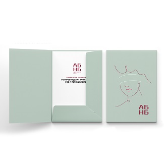
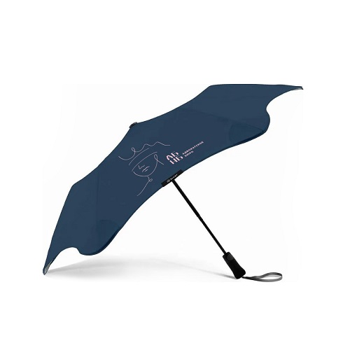
The main element of the corporate style was a pencil portrait of Themis, the goddess of law and legal order, painted in an interesting manner. In the same manner, the portraits of Nina Boer herself, the bureau’s partners, and the company’s pet dog Lea were painted.

 |
 |
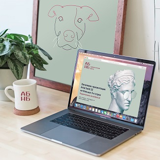 |
The corporate identity of the company is made in the chosen colors and is a combination of severity and solidity of the logo with the lightness and airiness of a pencil drawing.
 |
 |
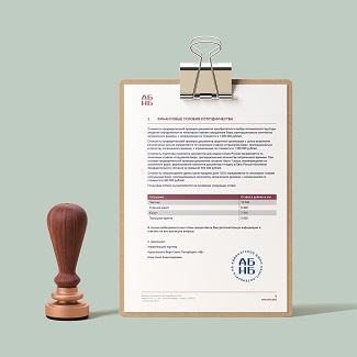 |
As part of the corporate identity work, the bureau now has a neat sign, an easy-to-use guidebook, and stylish merchandise.
 |
 |
 |
 |