Inflex

As part of the development of the new logo, 5 completely different options were proposed. As a result, we chose the one that can rather be called a restyling of the existing logo than a new version. This decision was due to the peculiarities of the client’s target audience, their conservatism and cool attitude towards drastic changes. But now it is a completely different material! The logo has a clear philosophy, the right proportions, it is built according to clear rules, it looks much more modern, and most importantly — it is easy to use.
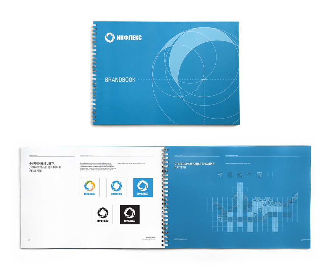
We have prepared a handy guide to the use of the logo and corporate identity, which regulates in detail all the nuances of using the new visual language of the brand.
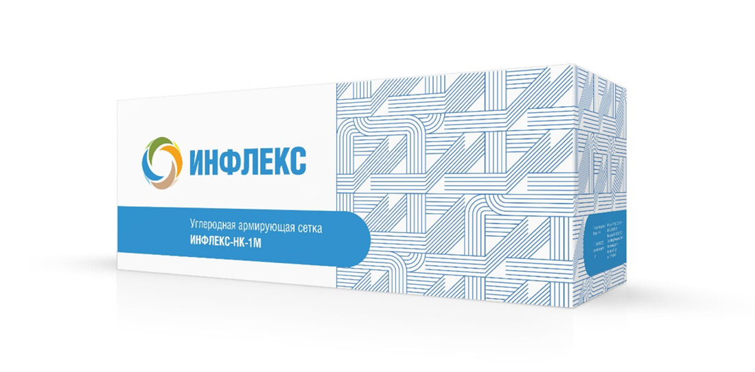
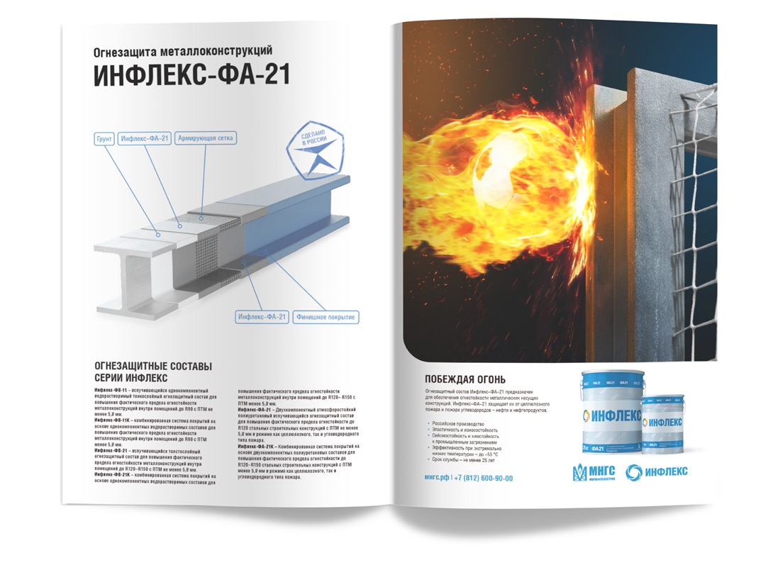
We also developed a new design of product packaging, which is easy to use and looks relevant.
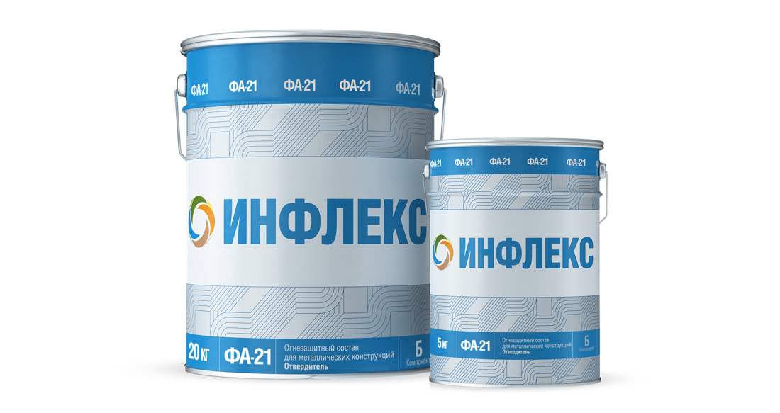
Now the product and its packaging are adequate to each other
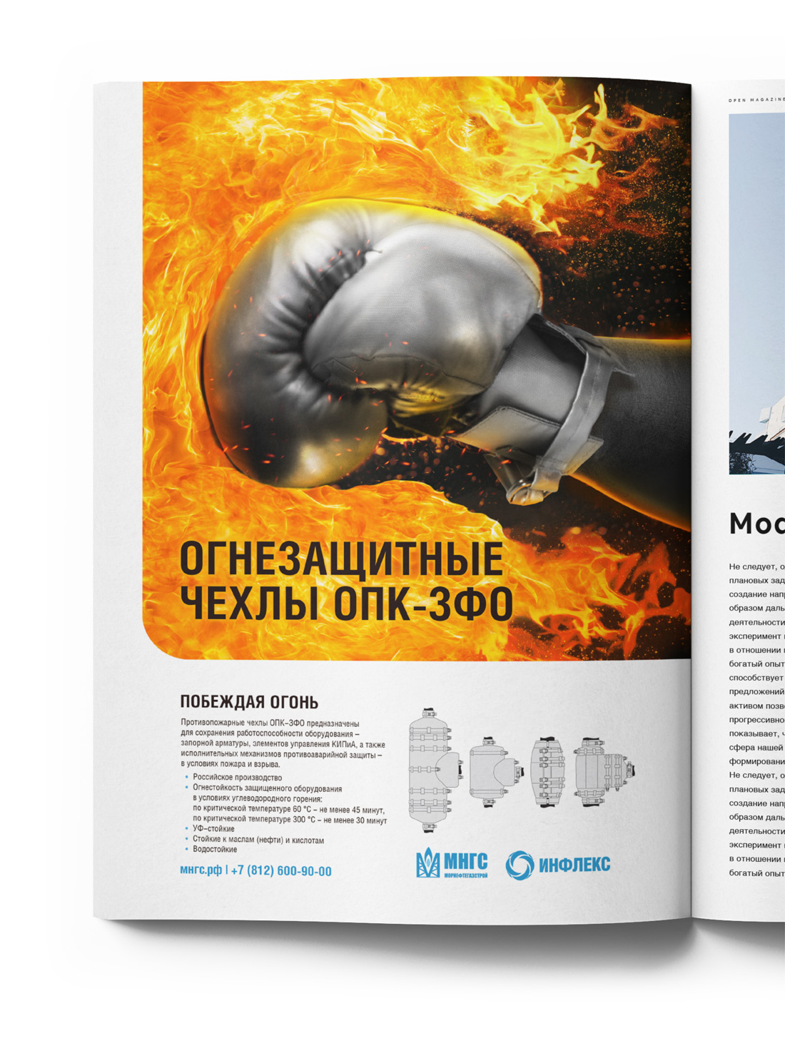
We also developed a series of advertising layouts for the professional press, which differ from the stylistics of images adopted in the oil and gas industry
And, as is usually happens when you work with clients from completely different industries, we learned a lot.